Daksha School | Children’s Space
CLIENT NAME: Anita Rao
JOB: Logo Design
Creative Direction: Vydika Rao
Year: 2021

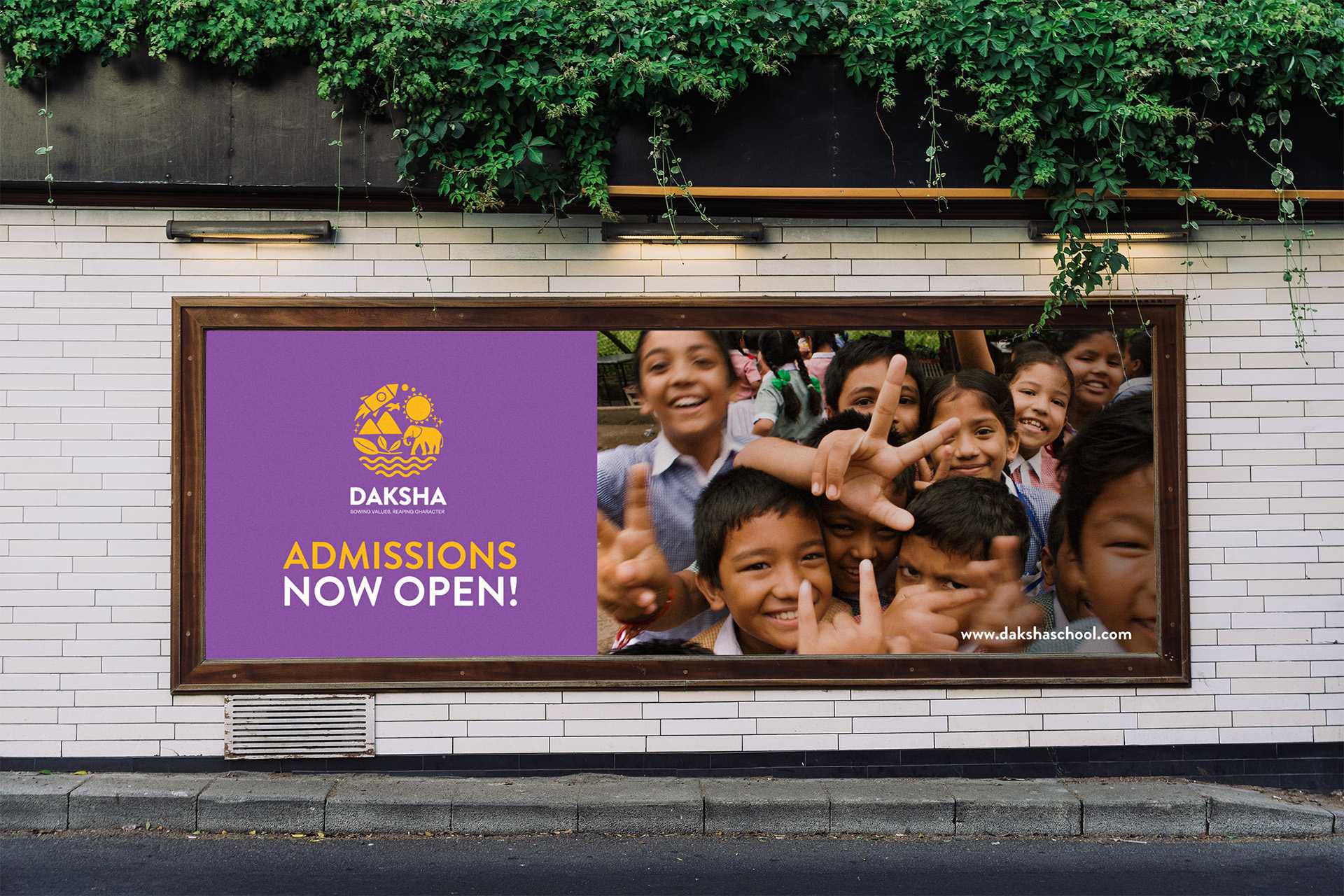
OVERVIEW: Daksha is a Pre Primary and Elementary School based in Hyderabad that has been around for over 15 years. They wanted their logo to be redesigned while keeping the primary element, the elephant, from their original logo in the new one. The main focus as a school is overall development + life skills.
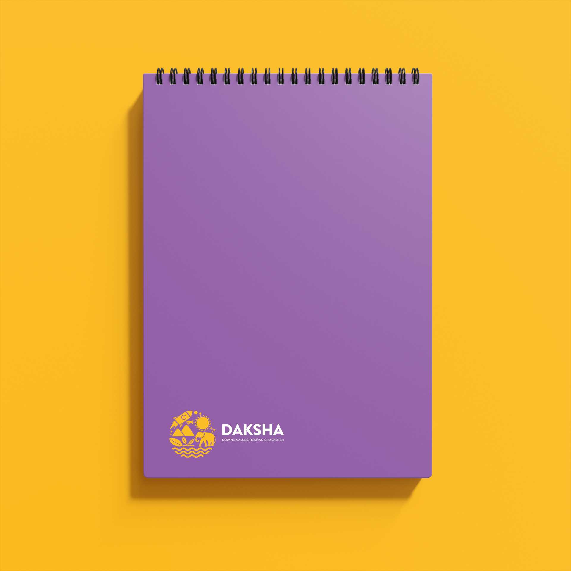
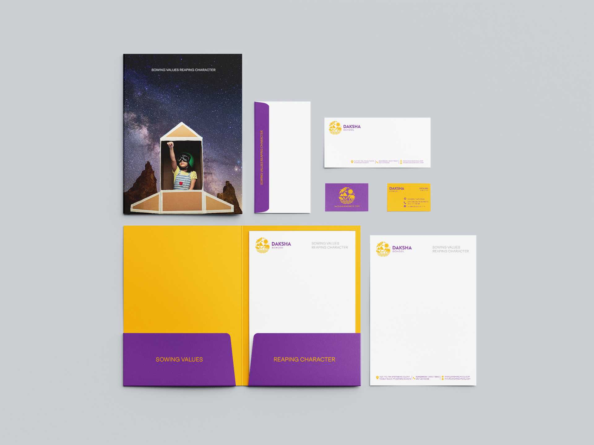
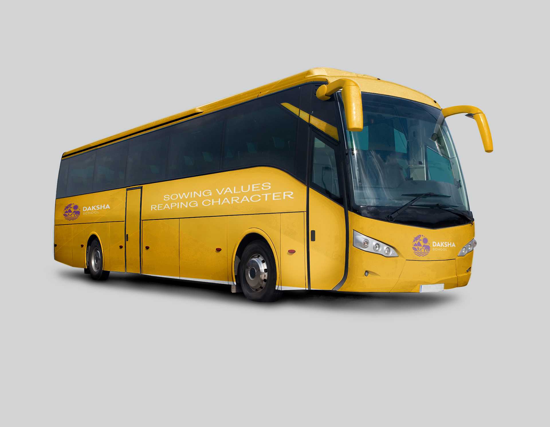
Logo Design: This logo has been made to communicate the holistic learning experience at Daksha. The colours used signify the energy and potential of the sun. The elements in this emblem represent Nature and Science. We have included Daksha's good old friend (from the original logo)- the elephant, to keep the connection going. We made 2 variations in their logos—one for the primary school and the other for their pre-primary school. The Pre Primary school logo is a more child-friendly version of the primary design. We want the children to feel like the school is growing with them.
