Frontline | Law
CLIENT NAME: Sneha Nagraj
JOB: Visual Identity
Creative Direction: Vydika Rao
WEBSITE: https://www.frontlinelaw.in/
Year: 2024

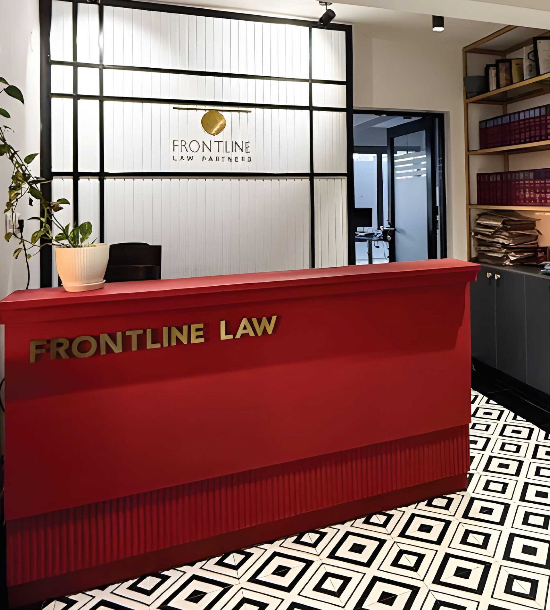
OVERVIEW: Frontline Law Partners reached out to us for a rebrand. They wanted a completely fresh look from their previous identity to represent their new team and work. They wanted to position themselves as a boutique law firm with a less is more approach where quality matters. They are a one stop shop with optimal solutions.
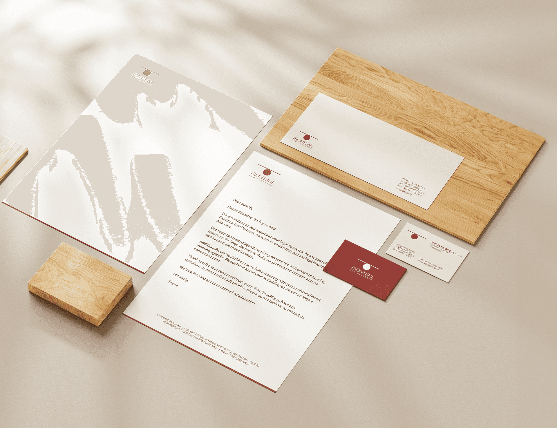
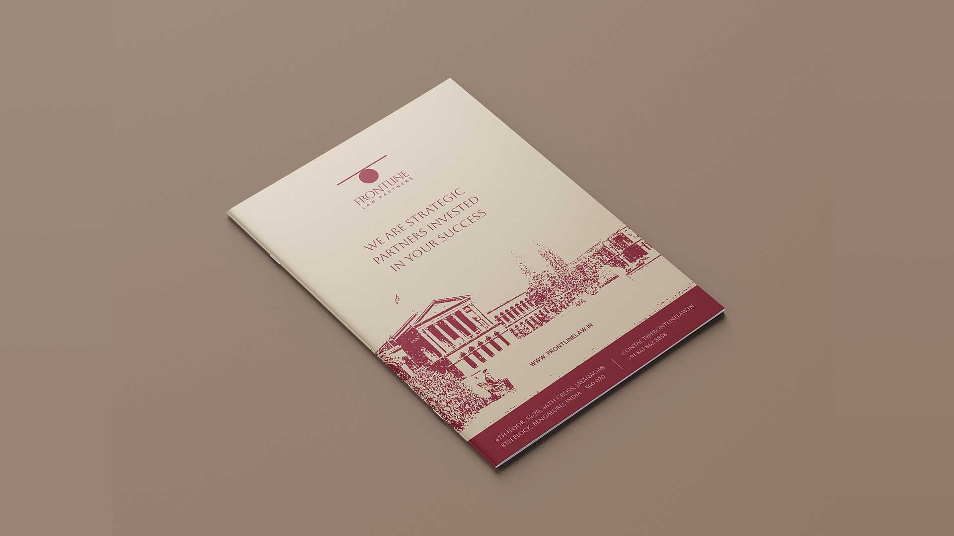
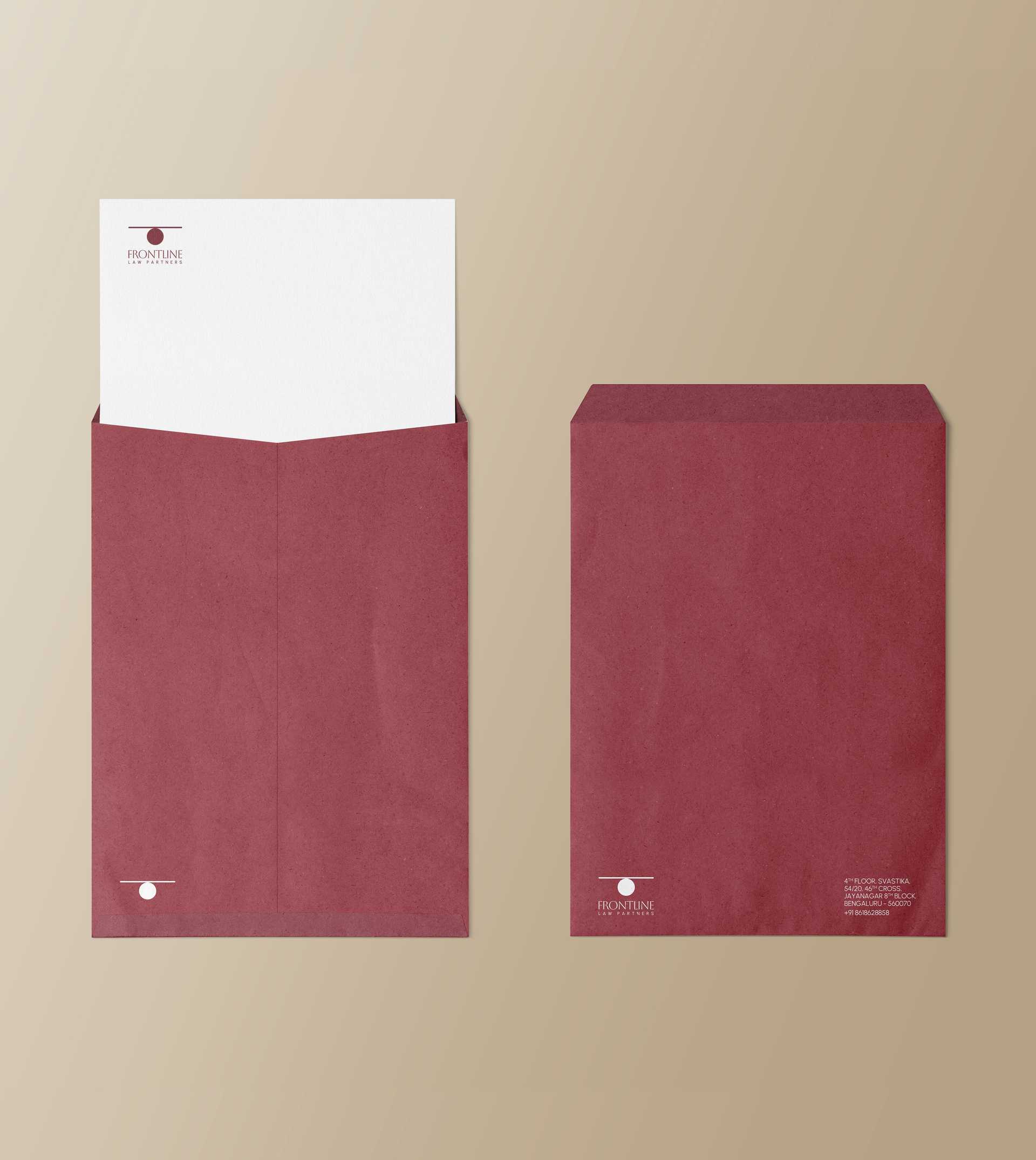
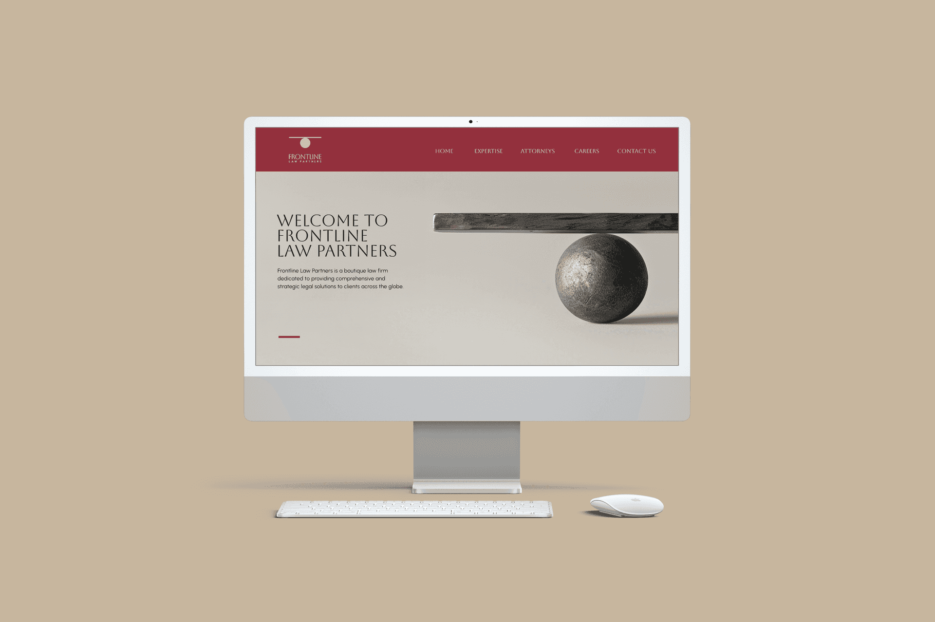
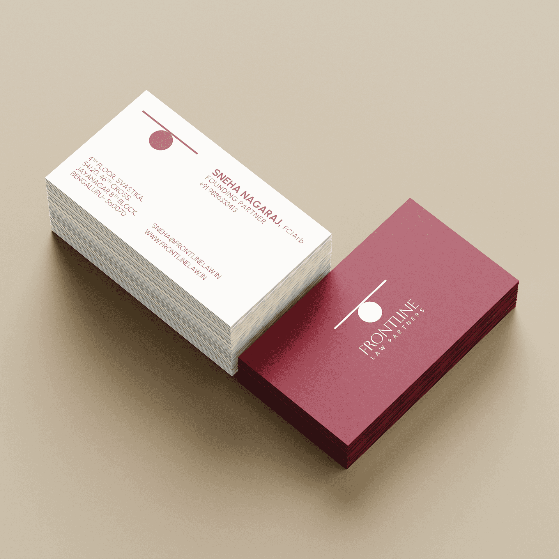
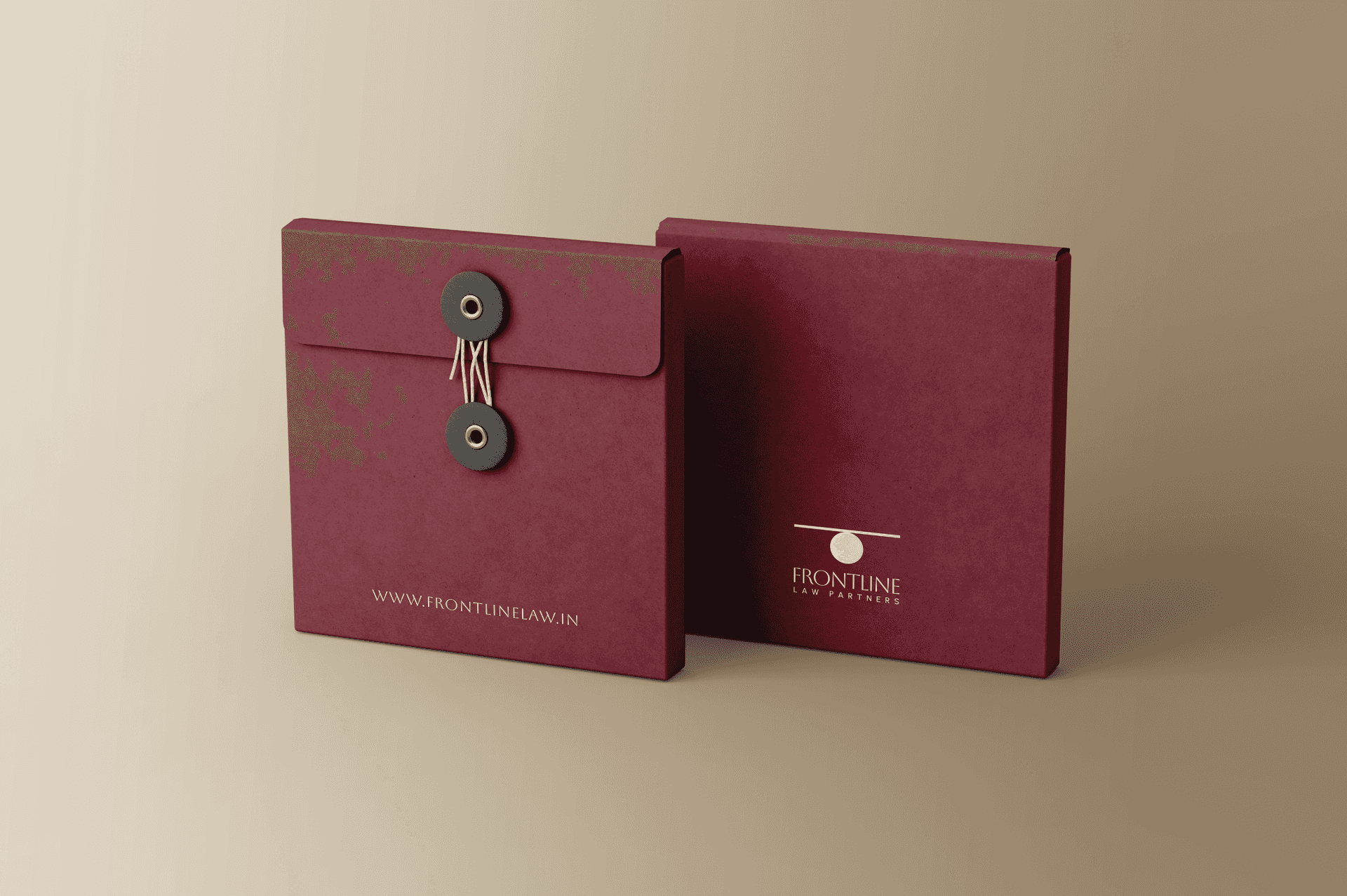
Visual Identity: We focused on their less is more approach and visually positioned them as a boutique law firm by creating a strong symbol to represent Law today. This symbol is a contemporary take on the scale of justice, that focuses on equal importance to both sides of the story. A simple logo mark that helps us look at the same concept with a new approach. We wanted the mood of the logo to also represent strength and hard work to communicate the personalities of the founders.
