Kria Montessori House | Childrens Space
CLIENT NAME: Prasannitha Errabelli
JOB: Creative Strategy, Brand Identity, Website Design
Creative Direction: Vydika Rao
team: Bhakti biyani, Naomika Dwidesh and Shravya Anireddy
WEBSITE: https://www.kriamontessorihouse.com/
Year: 2023

OVERVIEW: Kria Montessori focuses on the learning and growth of a child through its child-centric approach.
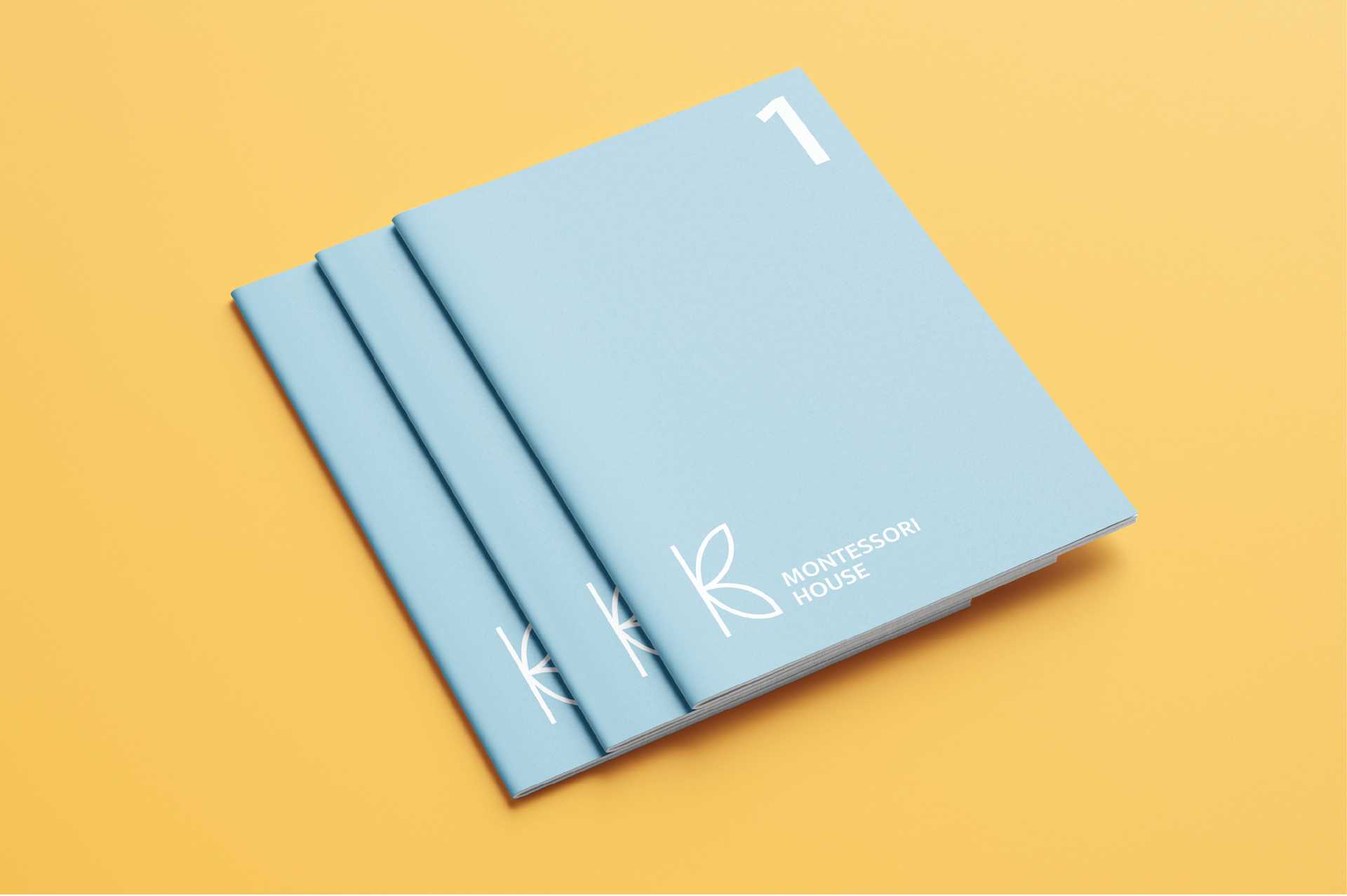
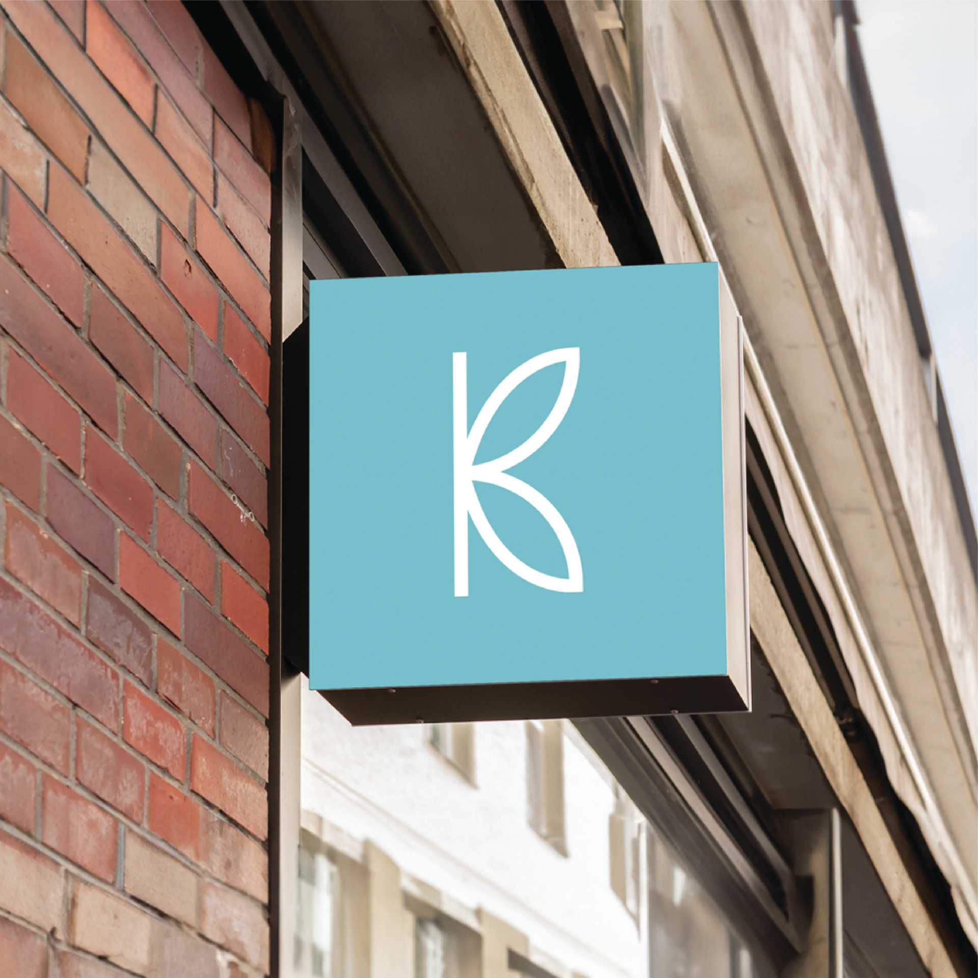
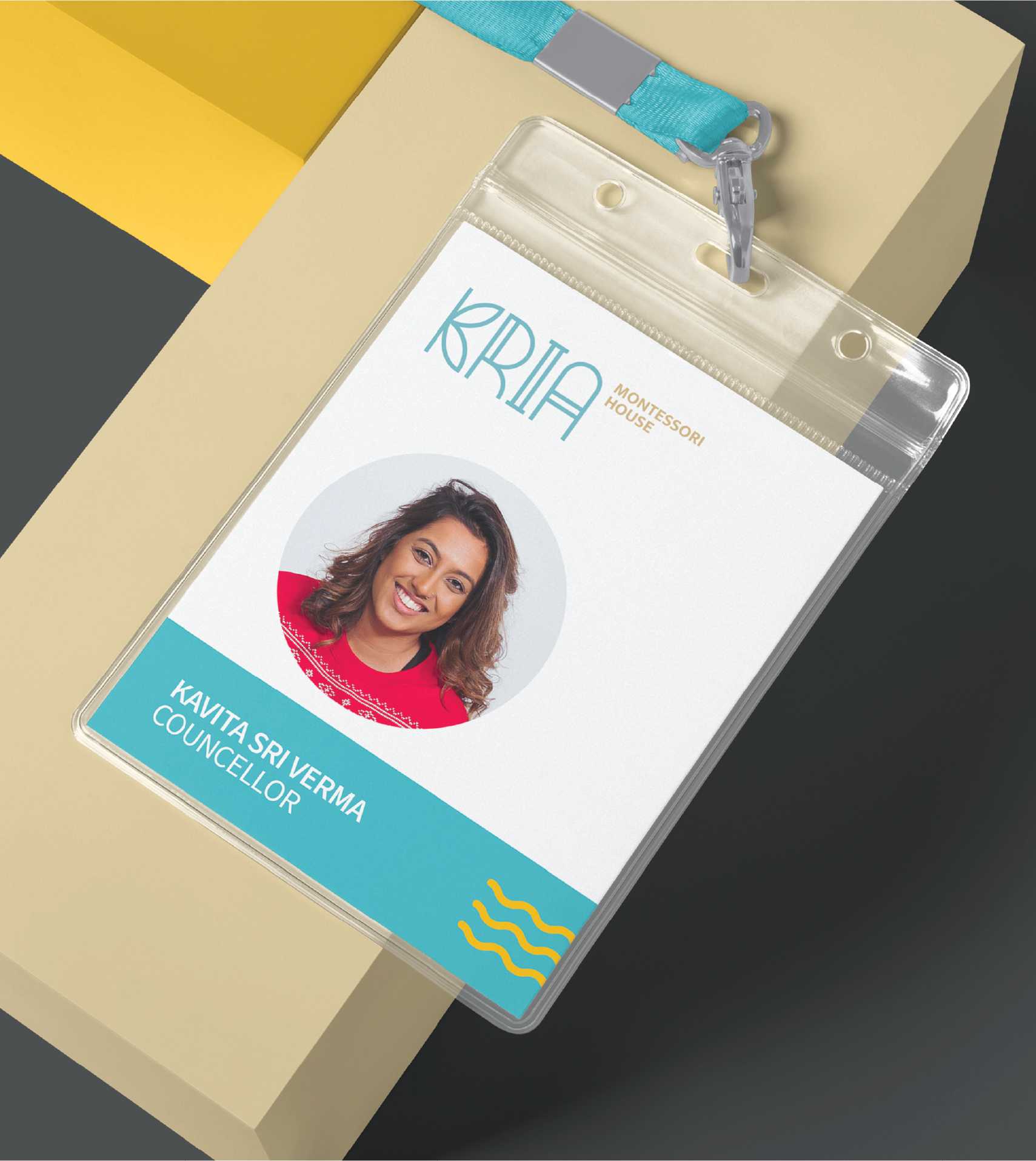
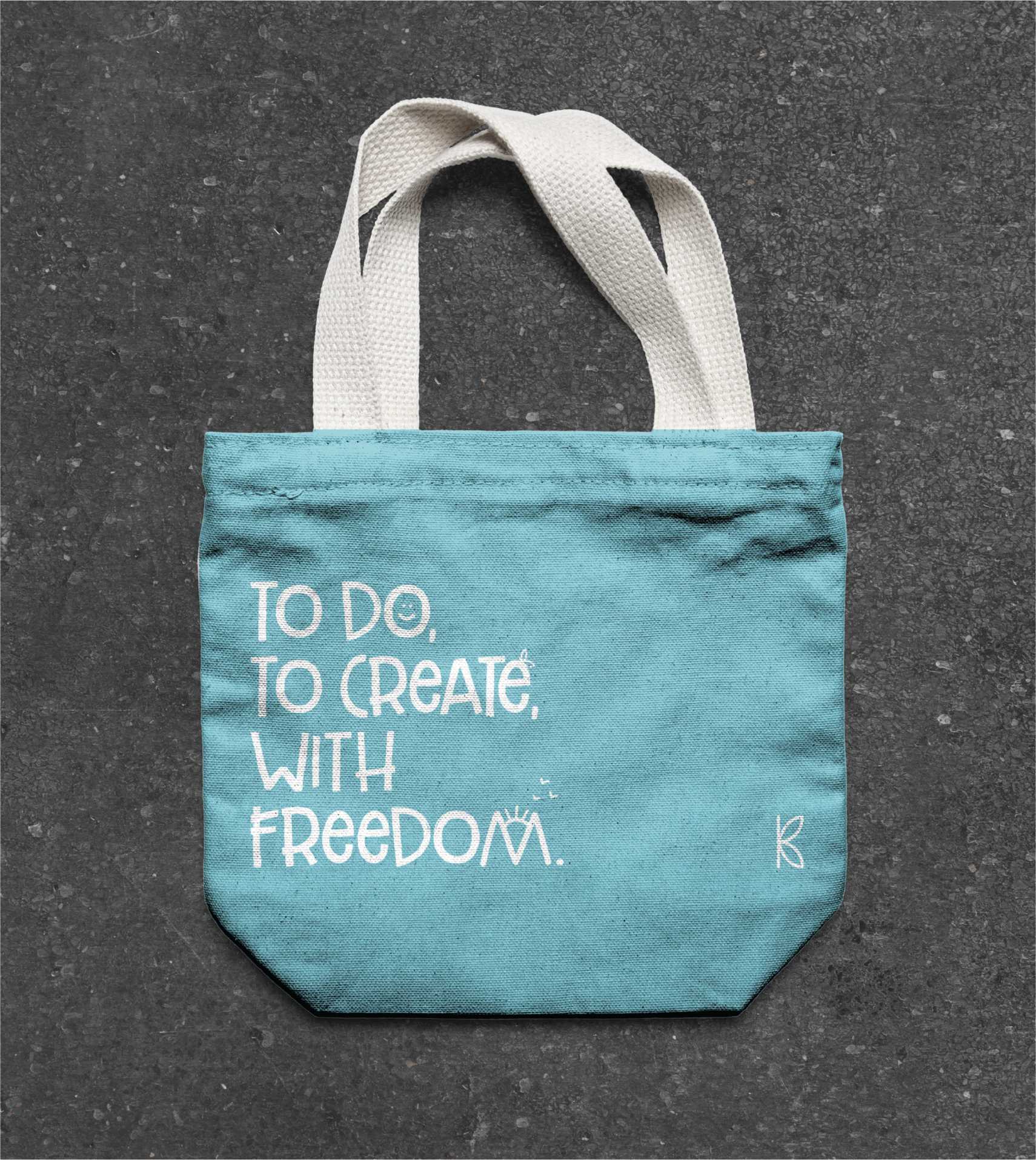
Logo Design: This typography-based logo signifies the meaning of Kria- to do and to create(with freedom). The K in the logo is a butterfly that represents growth and creativity. The other letters are playful abstract forms in a child's world.
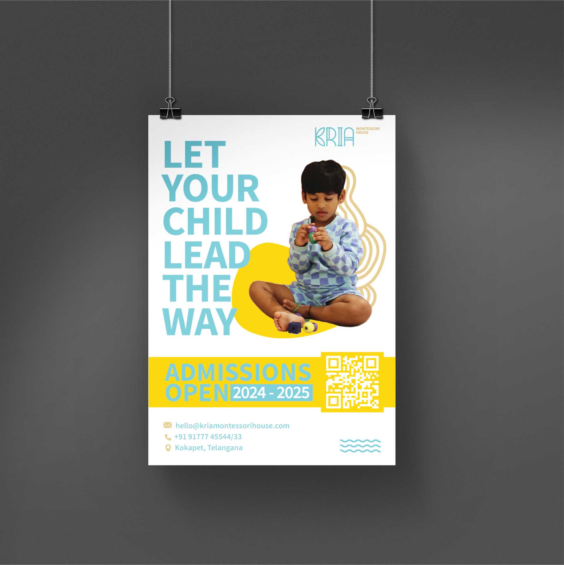

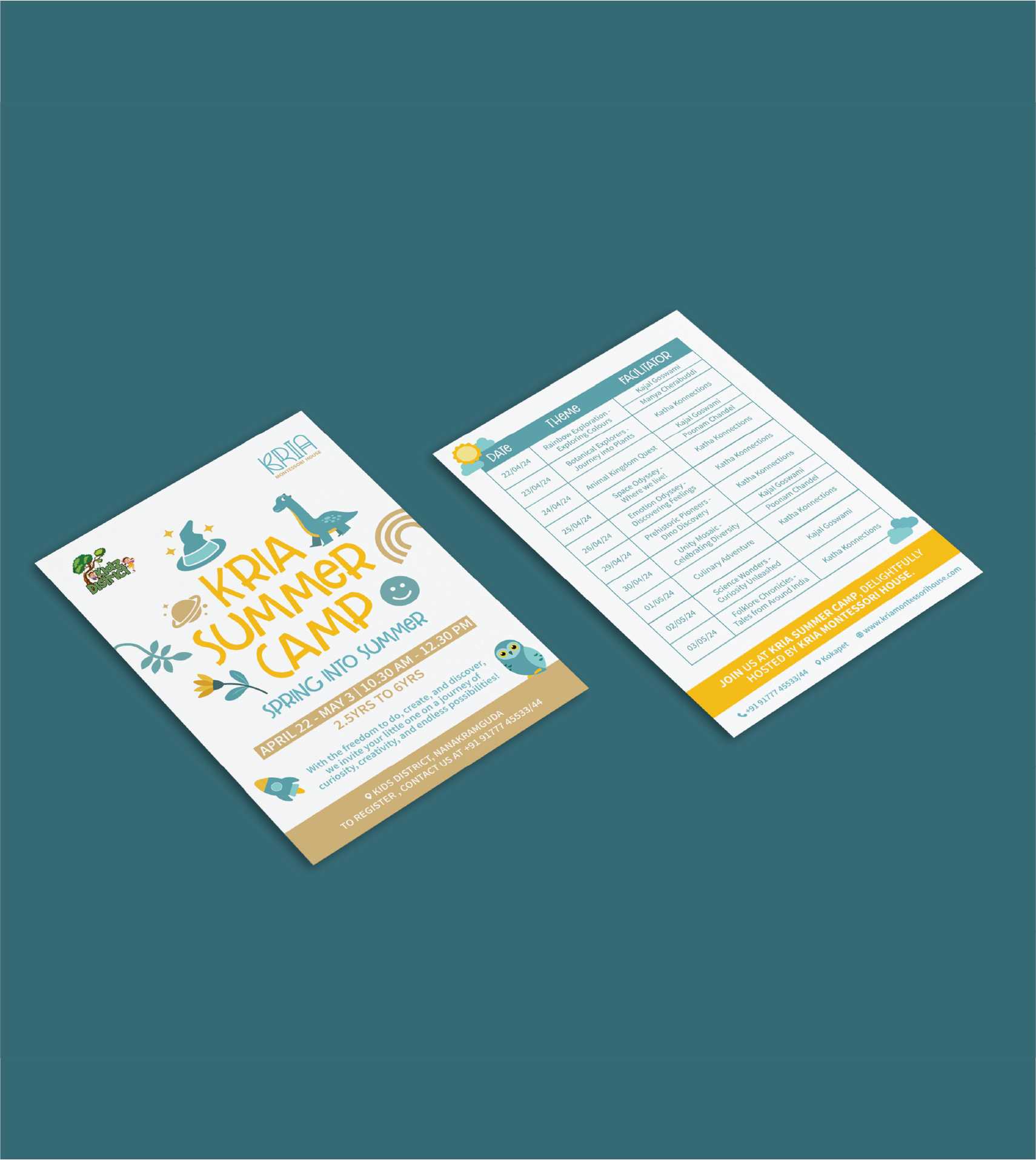
Website & Social Media
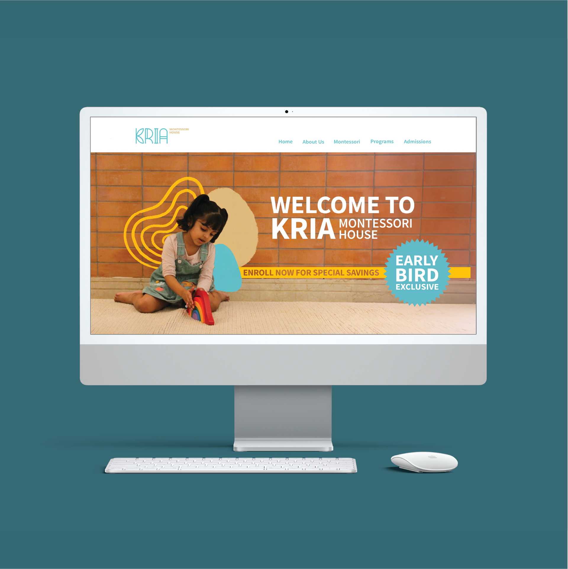
We designed a fun, playful website aimed at attracting young, open-minded parents with curious children, reflecting both the Kria brand and the Montessori philosophy of structured freedom.

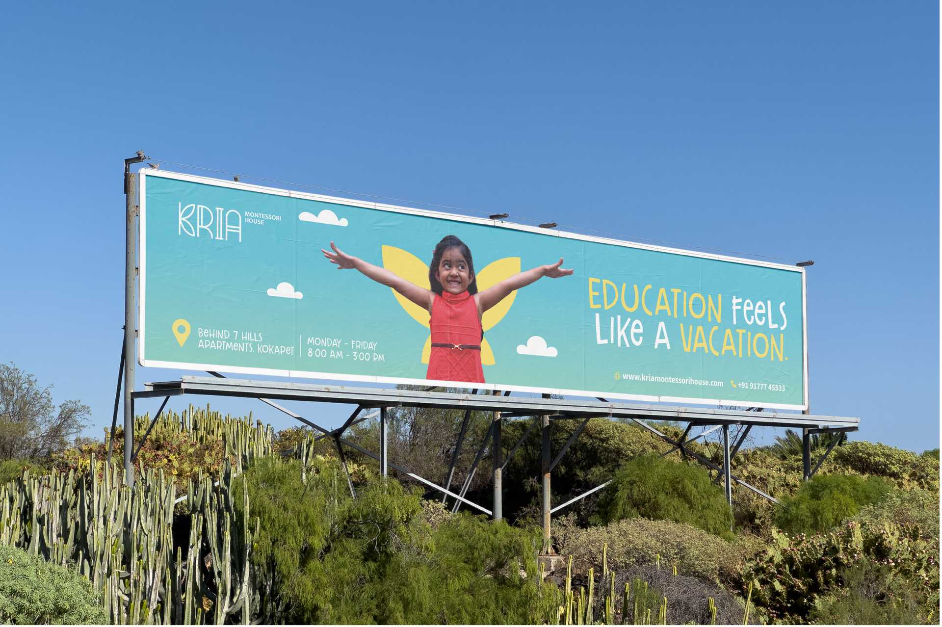
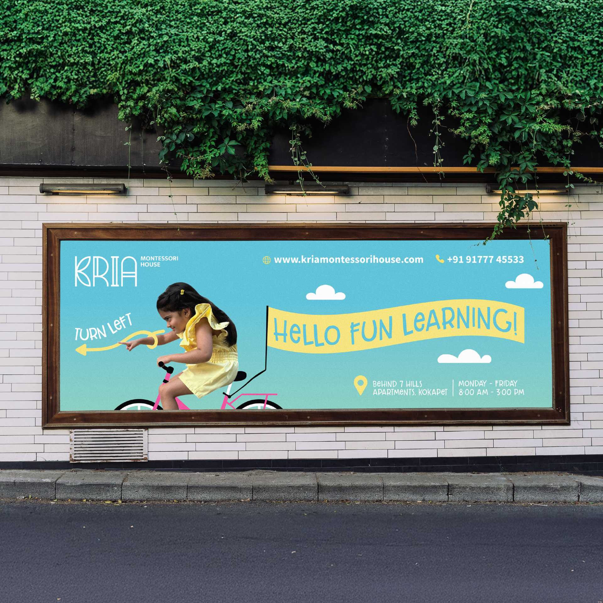
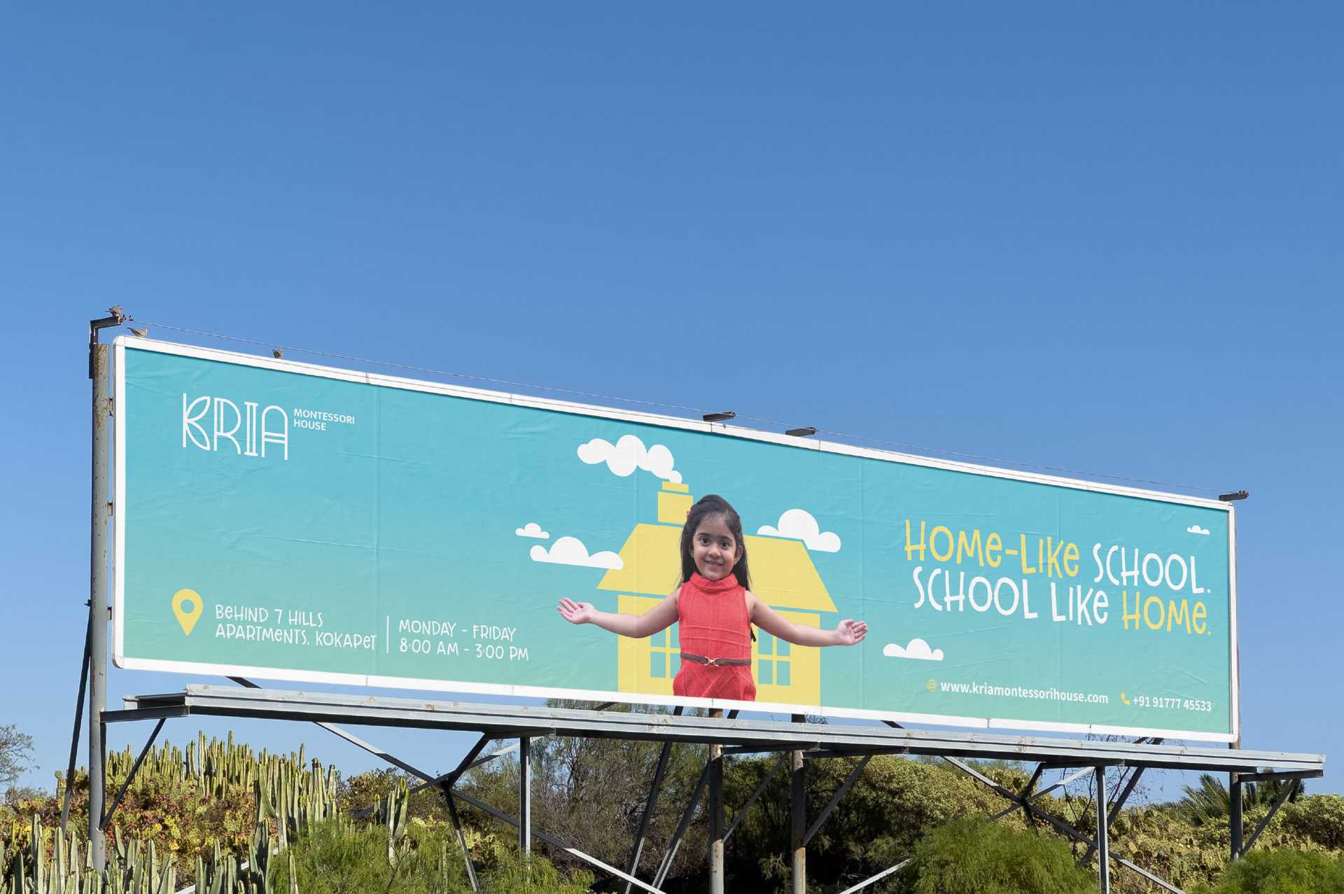
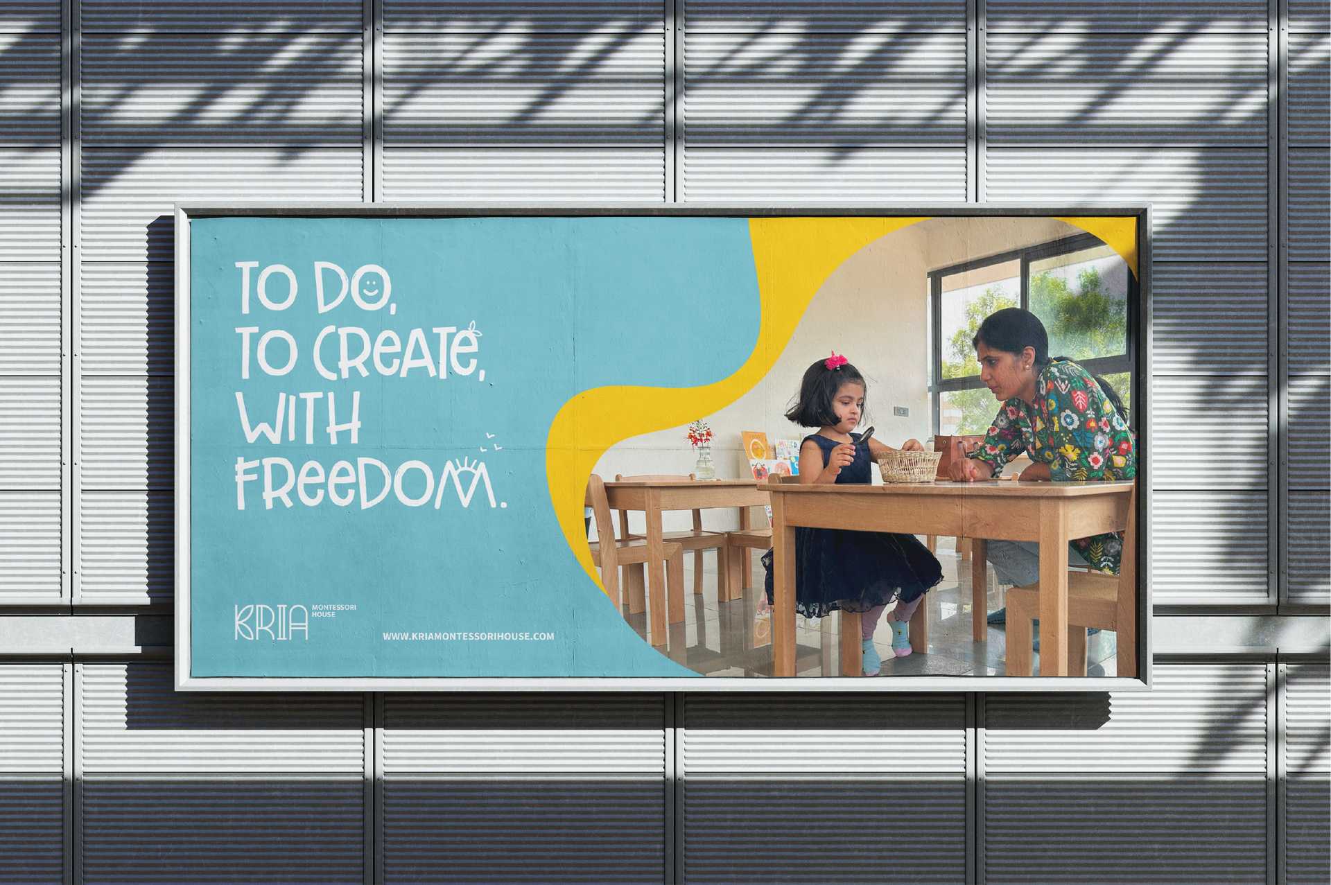
Outdoor Advertisement
These outdoor hoardings bring alive the Montessori spirit — where learning feels as natural as play. Centered around a child exploring her surroundings, creating a warm and curious space of discovery. Illustrations interact with the child, reflecting the Montessori way of learning through doing and observing. Designed to spark curiosity among parents, the campaign invites them to imagine this nurturing environment and visit Kria to experience it firsthand. It captures Kria’s belief that education should feel effortless, joyful, and alive — a world where curiosity leads every step.
