Madhura Group | Construction Equipment Industry
CLIENT NAME: Madhusudan Katragadda
JOB: Visual Identity
Creative Direction: Vydika Rao
team: Shreya, Aditi
Year: 2015

OVERVIEW: Madhura Group needed an identity that would stand apart in the construction equipment industry while speaking to their diverse audience across civic and industrial projects.
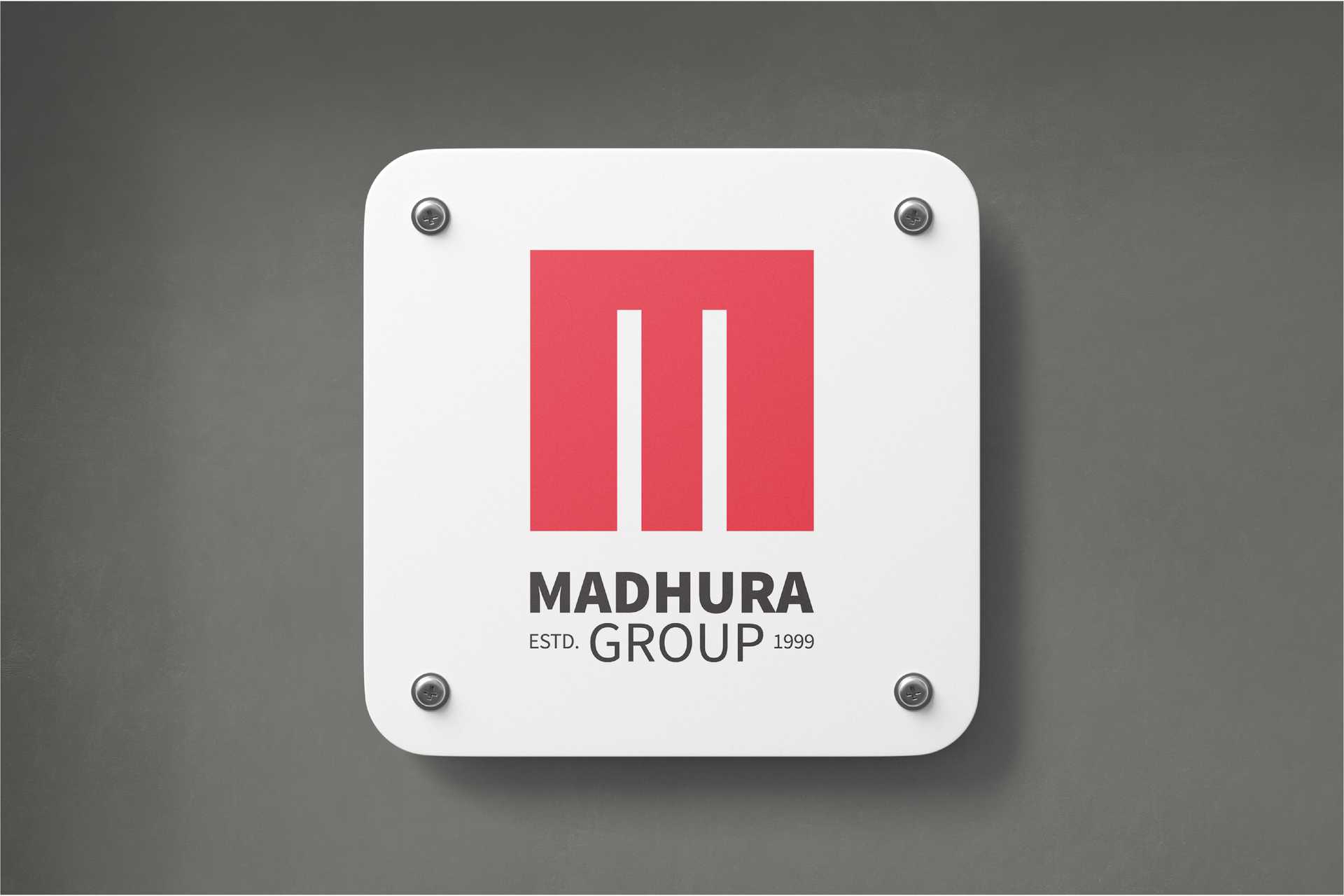
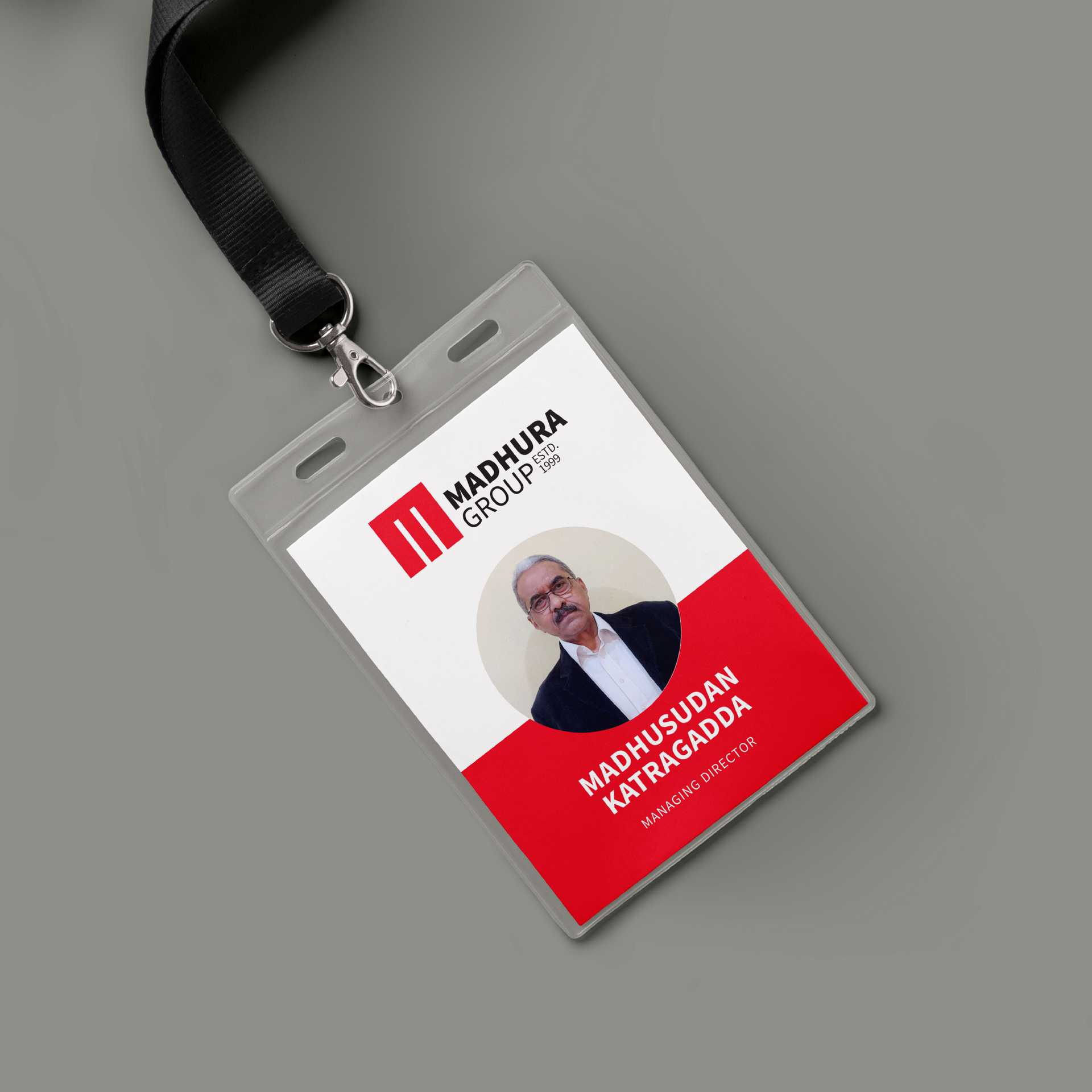
Logo Design: The logo was built around strength and reliability. The “M” doubles as a bridge— solid and enduring, capable of carrying weight— while also transforming into an “E,” a subtle nod to engineering.
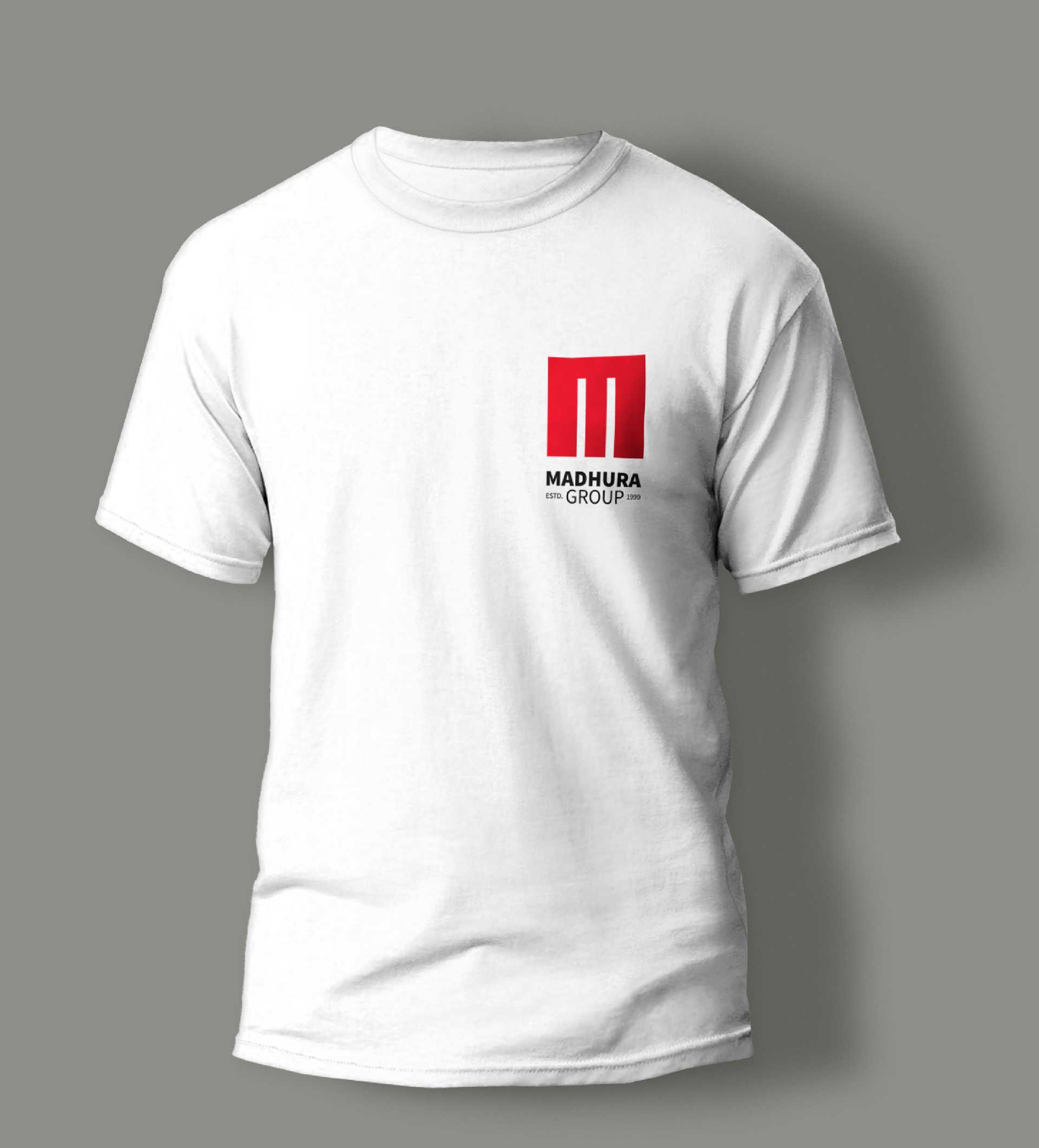
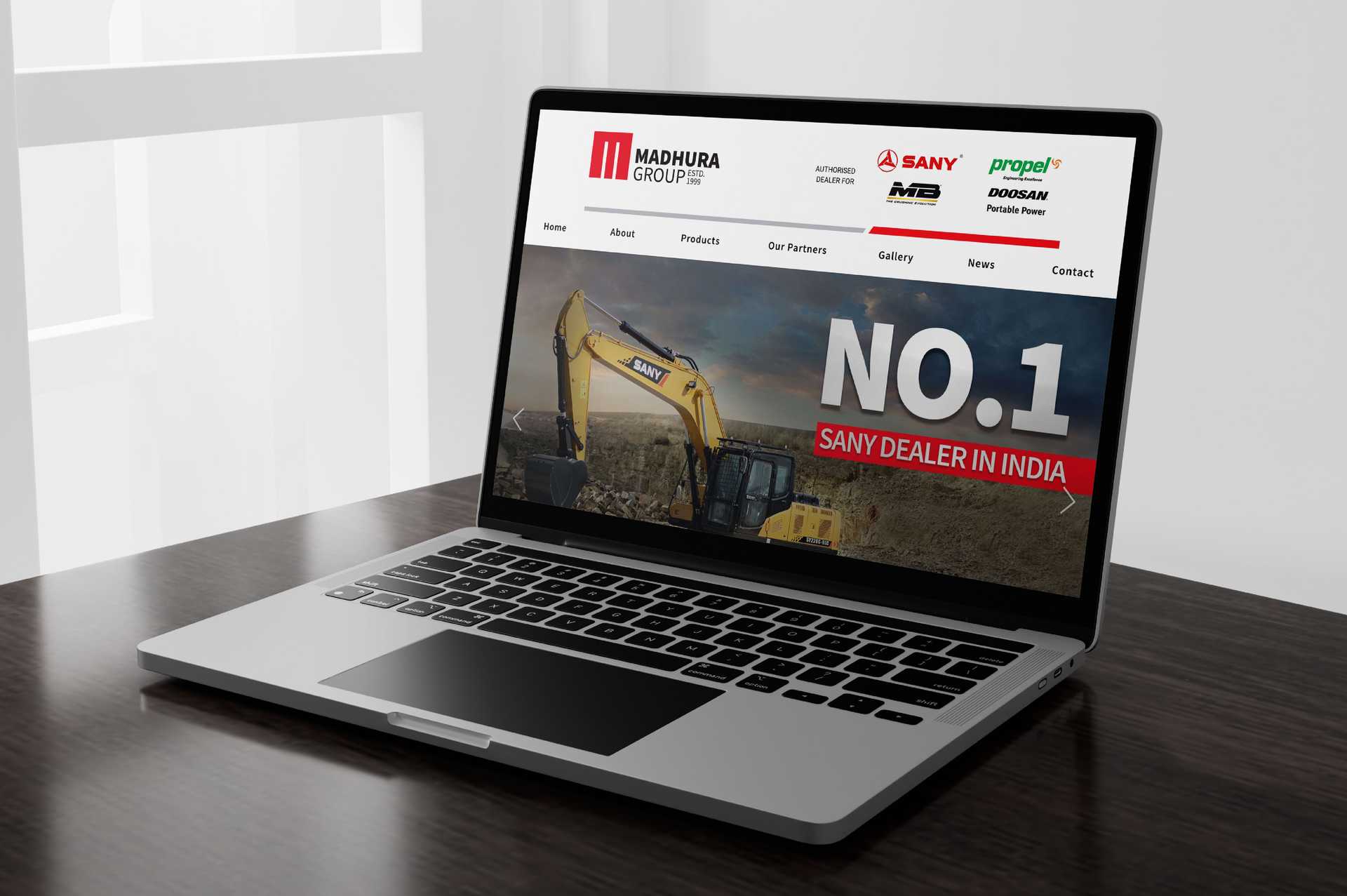
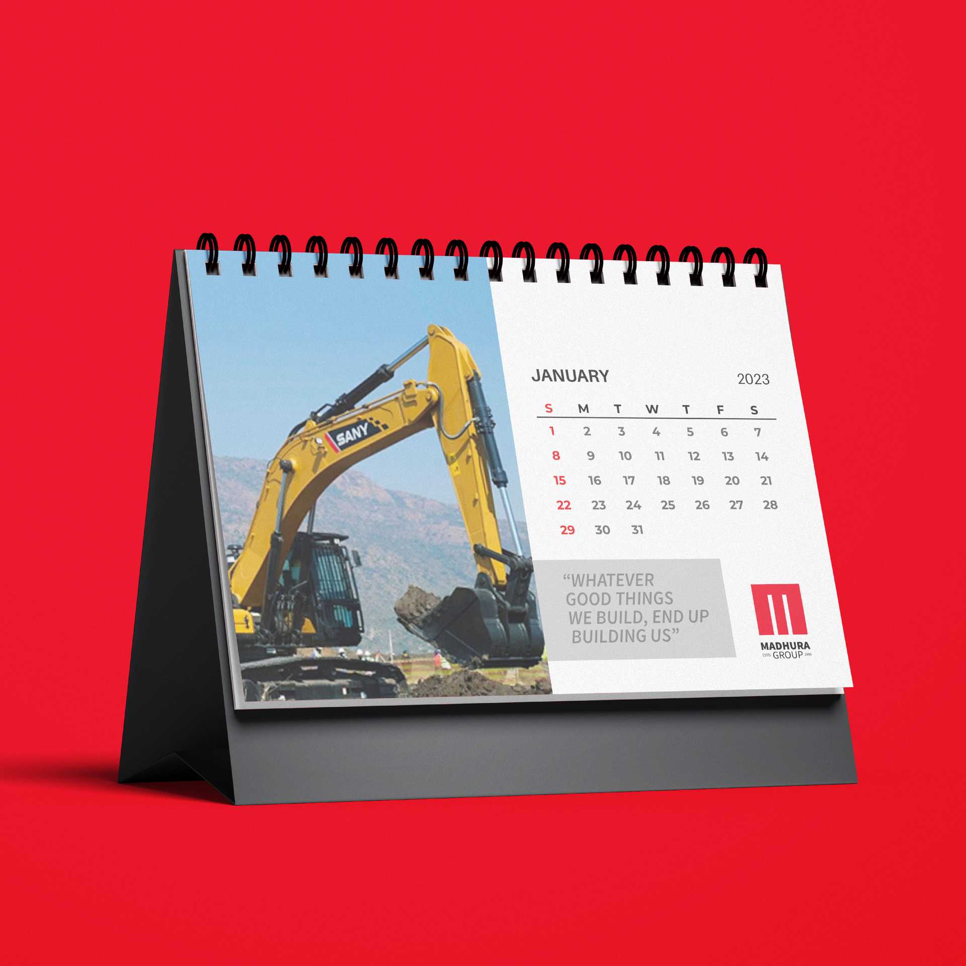
Logo Design
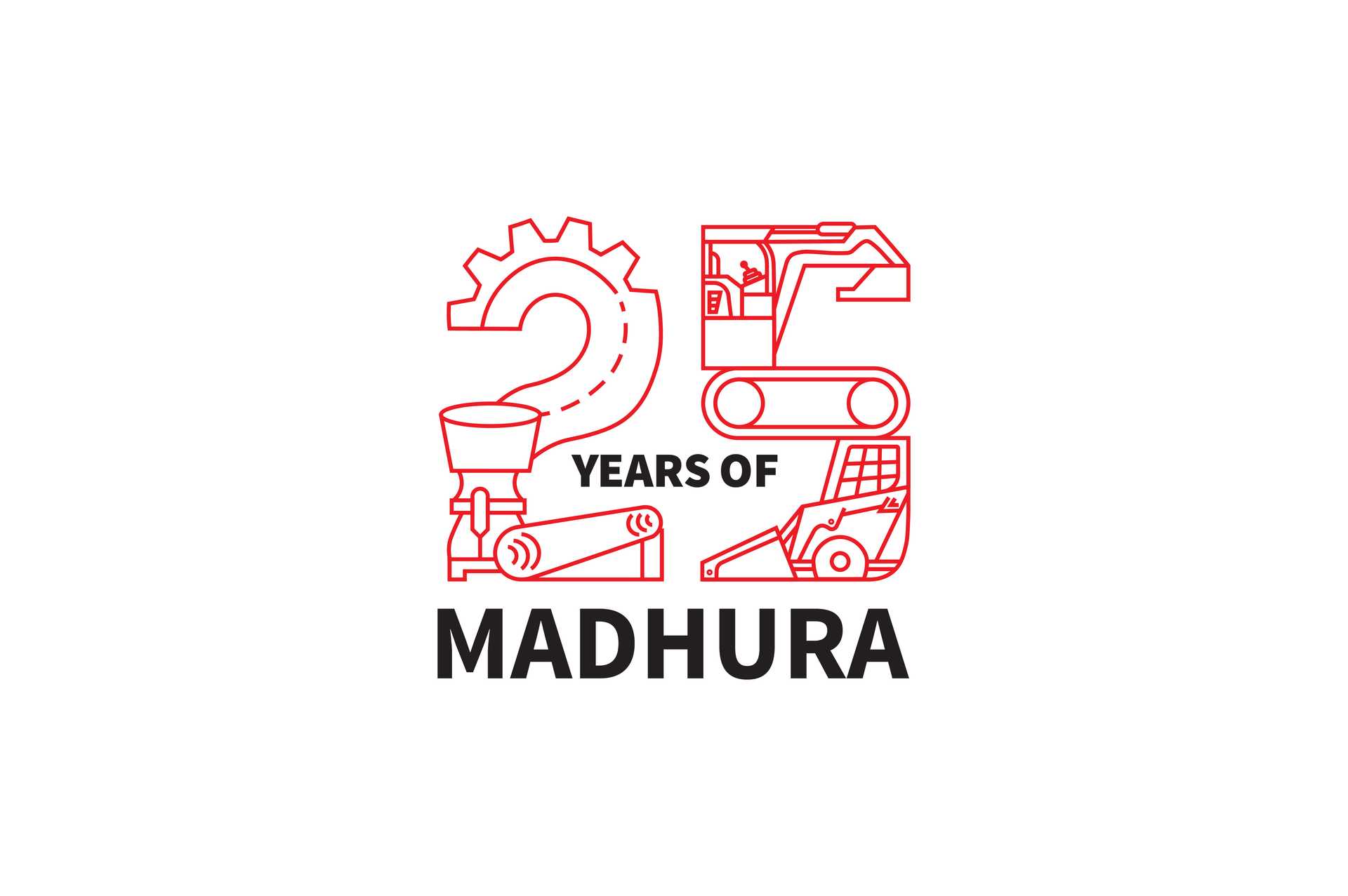
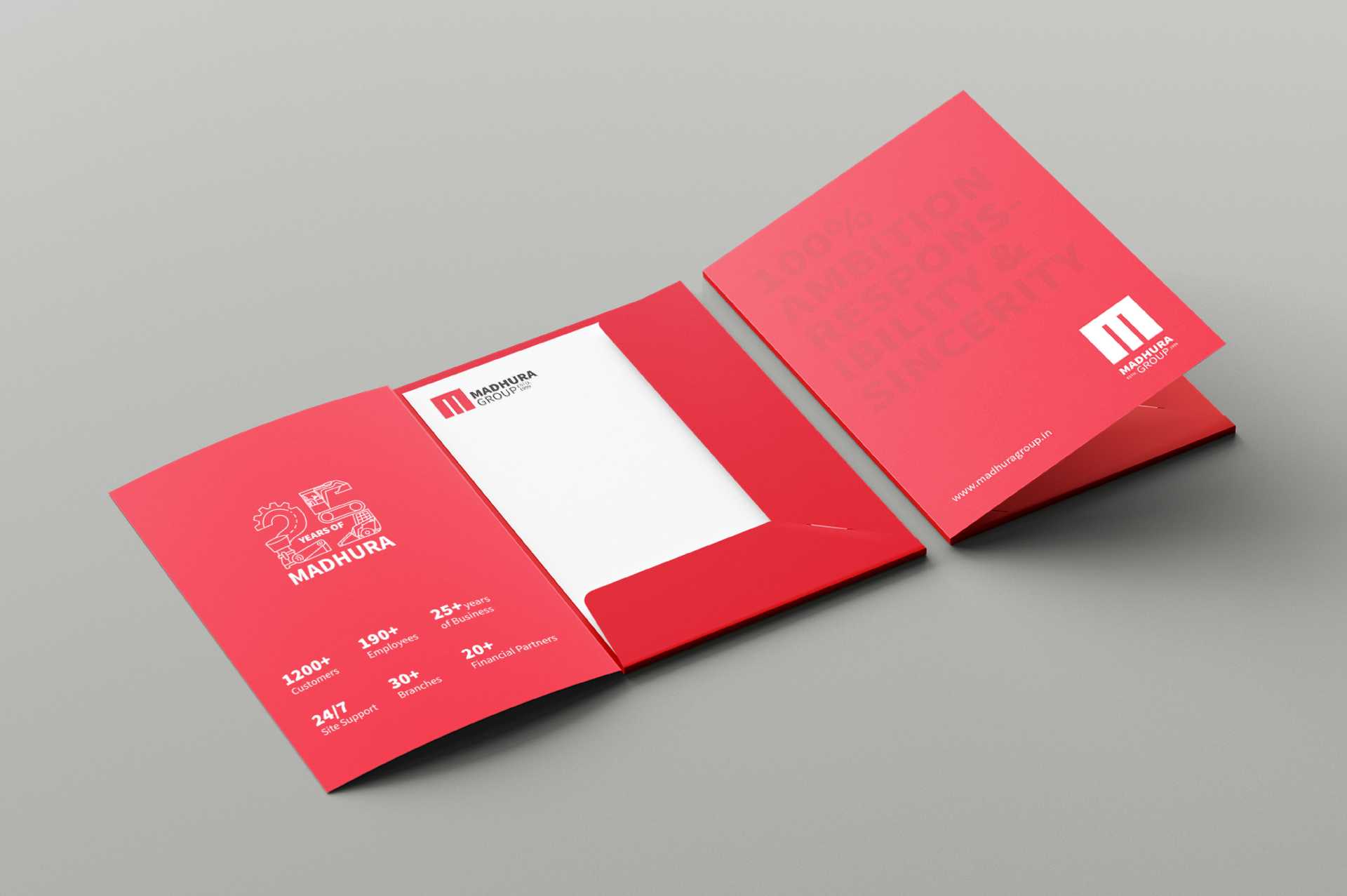
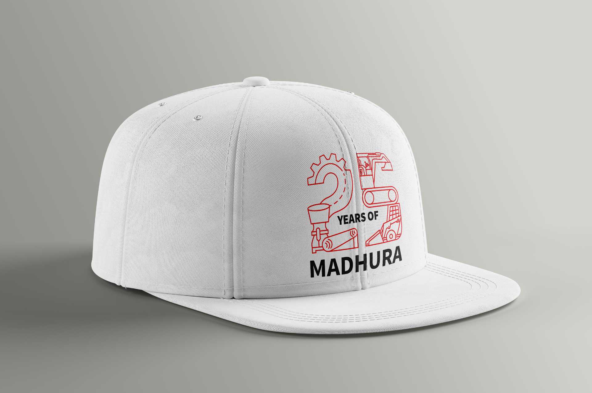
A milestone of 25 years demanded more than a number. Madhura Group’s anniversary logo became a distillation of its journey machinery drawn from across dealerships, layered with details of the functions that define them. It’s not just a mark of longevity, but a portrait of responsible ambition— a glimpse into how the last quarter century has been built, one machine at a time.
