Us | Health & Wellness
CLIENT NAME: Emma Waddington
JOB: Brand Design, Print & Digital Media Design
Creative Direction: Vydika Rao
Year: 2023

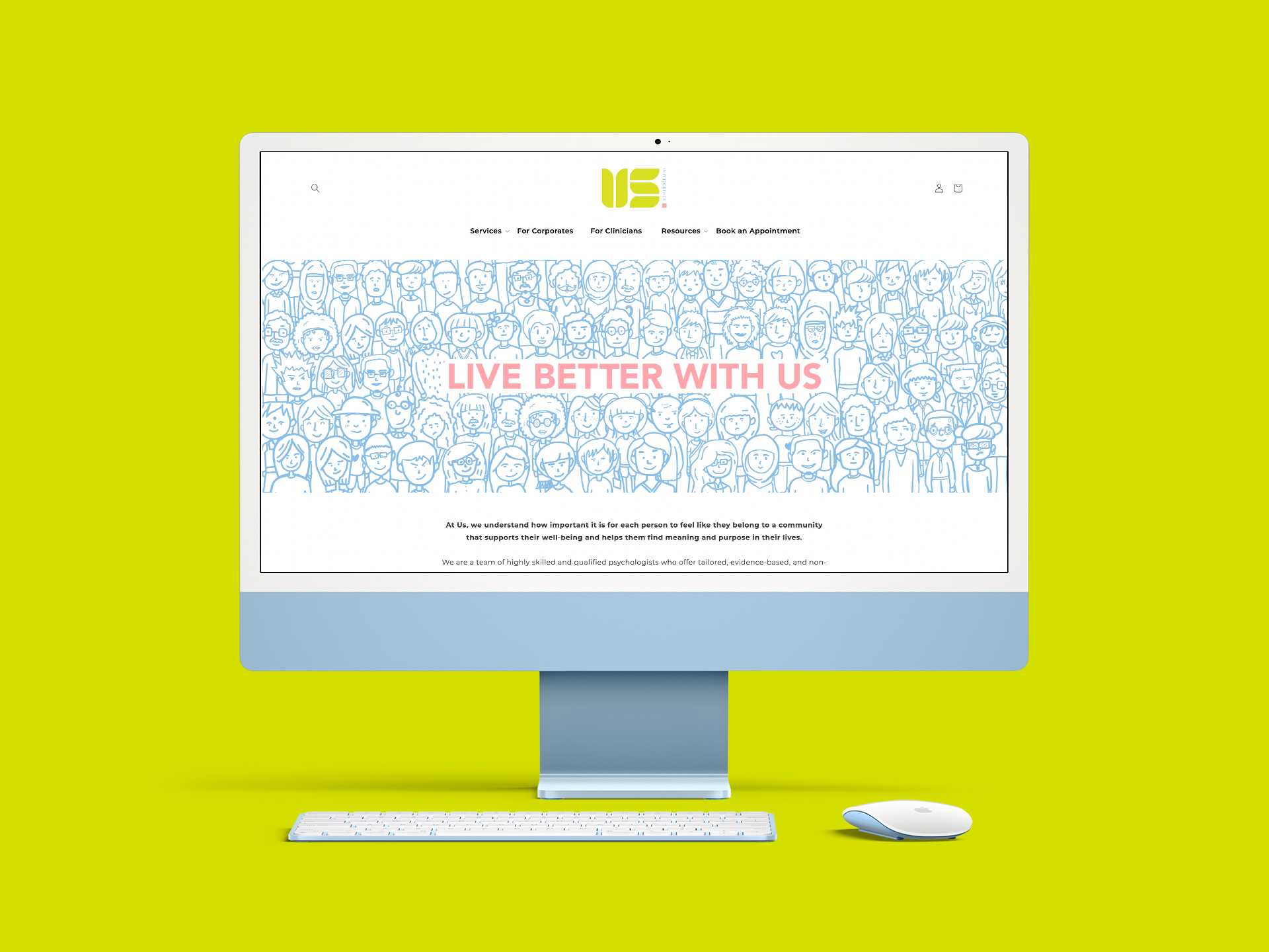
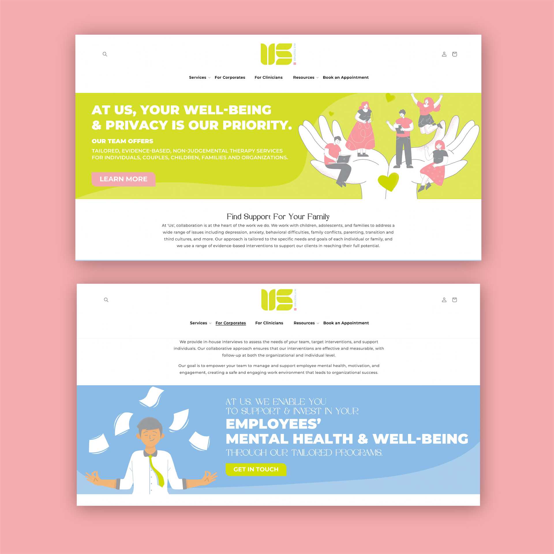
OVERVIEW: Us is a Mental Health and Well-being community in Singapore that hired us for Branding, Web Design and Social Media Campaign
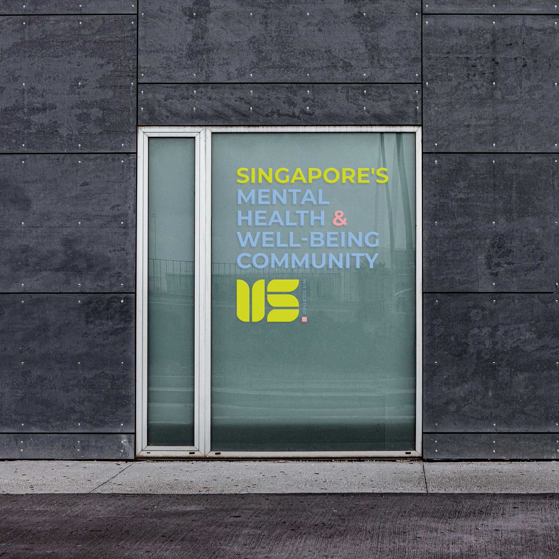
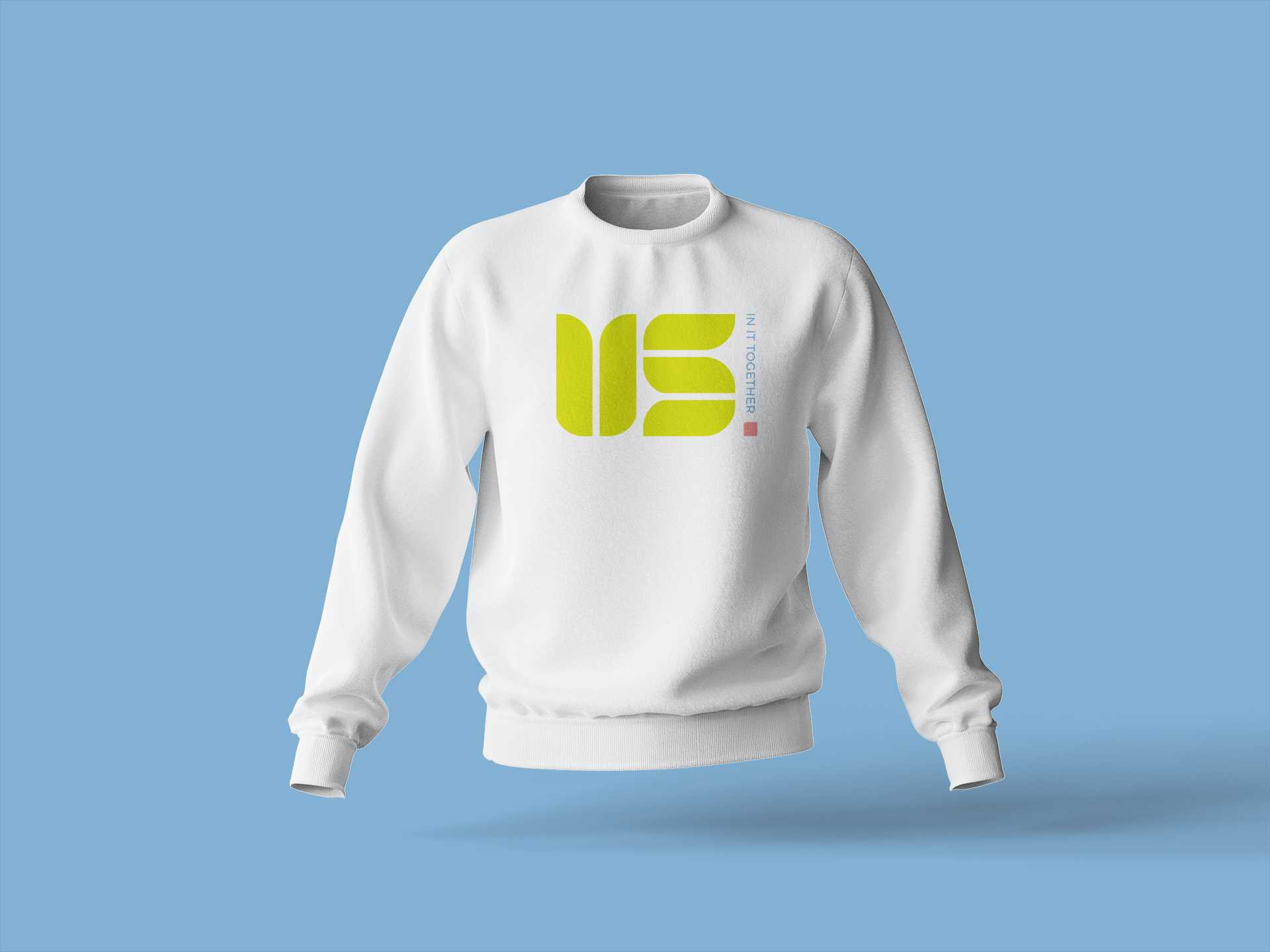
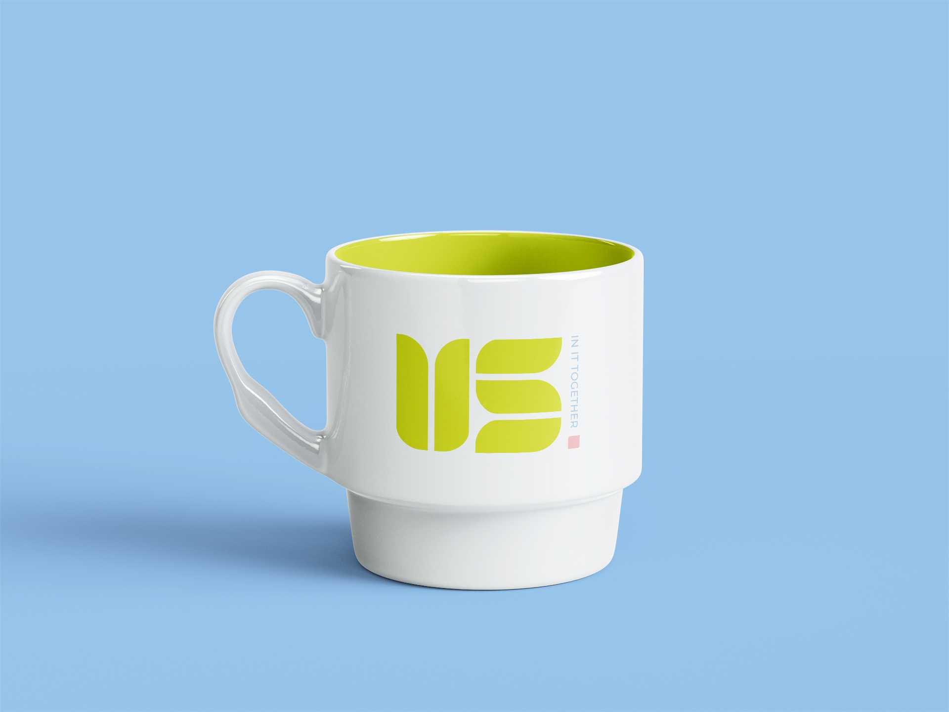
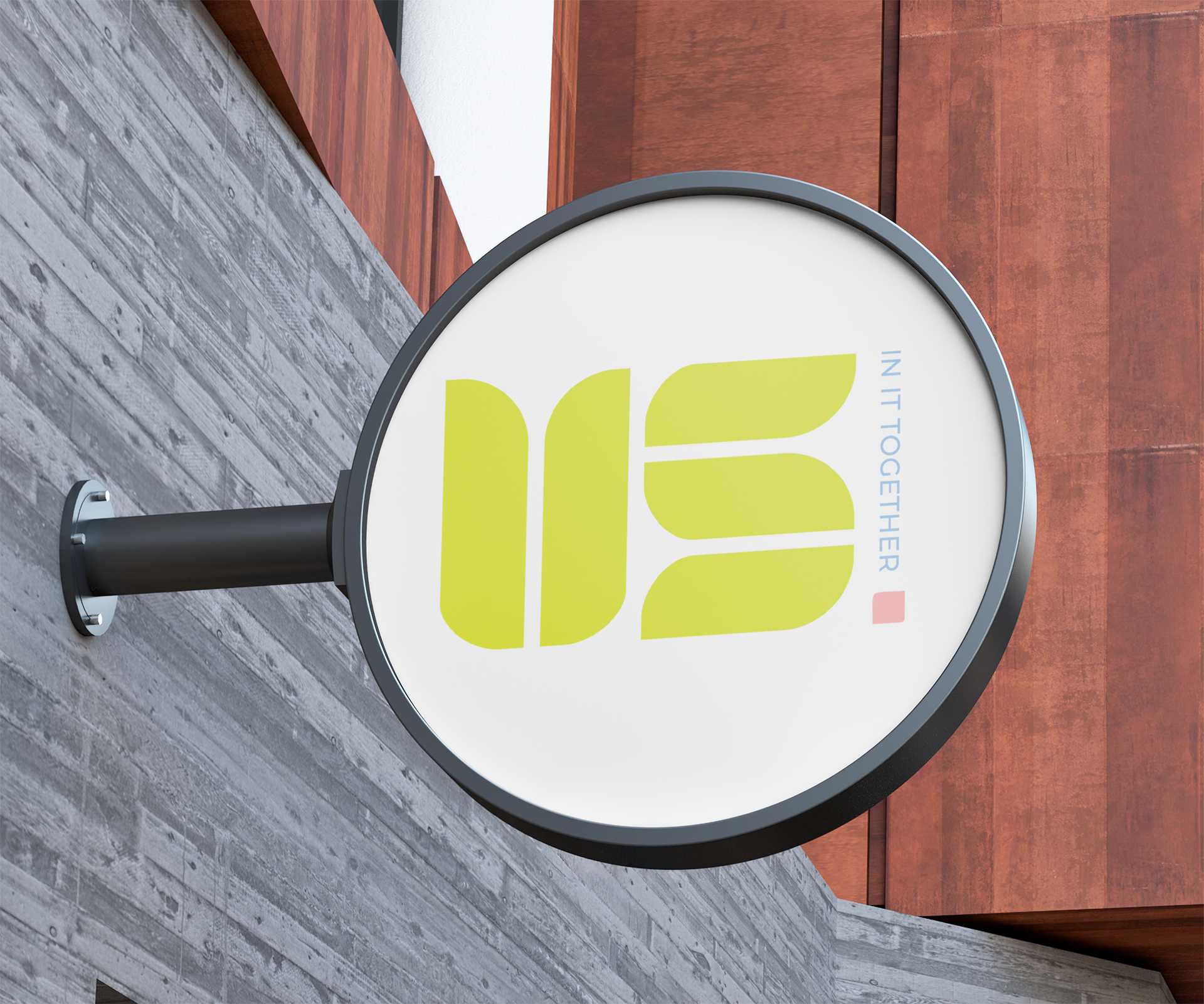
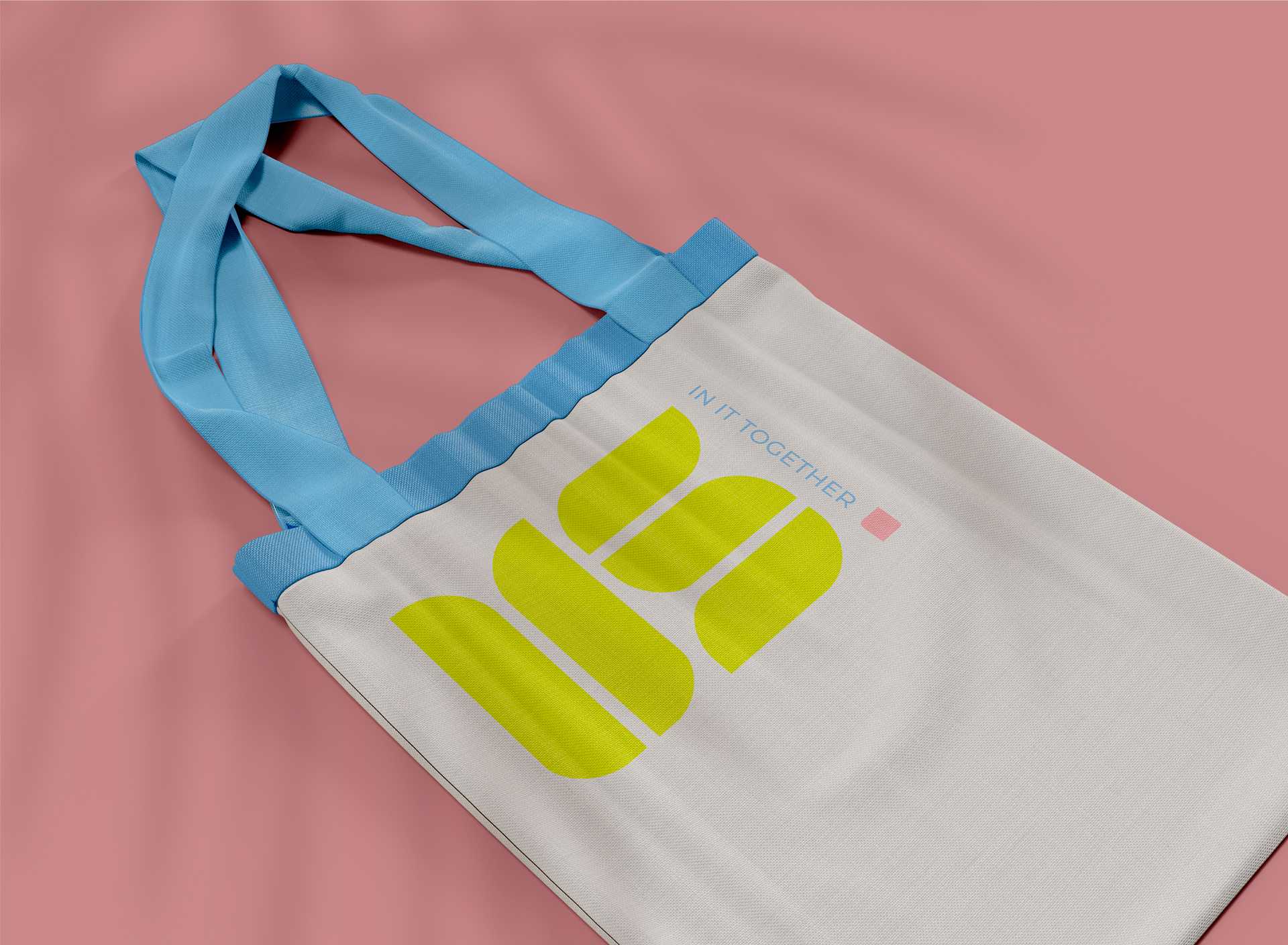
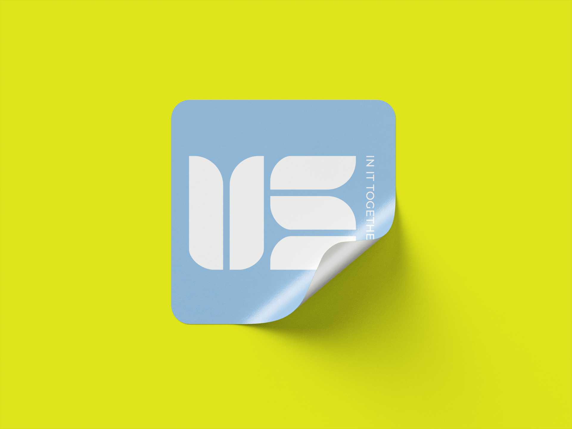
Brand Design: We created a wordmark logo. The two letters are created using the same shape placed at different angles to merge into the word- Us. These shapes also form a blooming flower that faces not only outward but also inward. The colours in this logo are meant to represent the brand's fresh, calming and approachable nature.
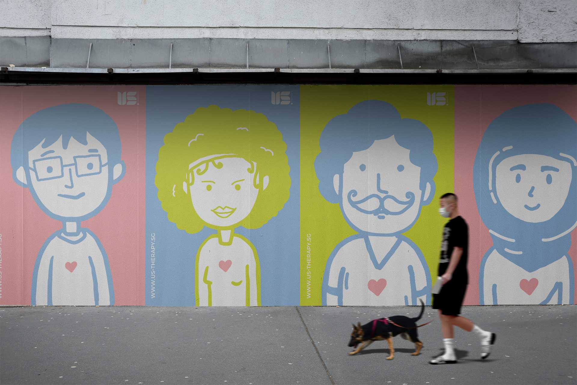
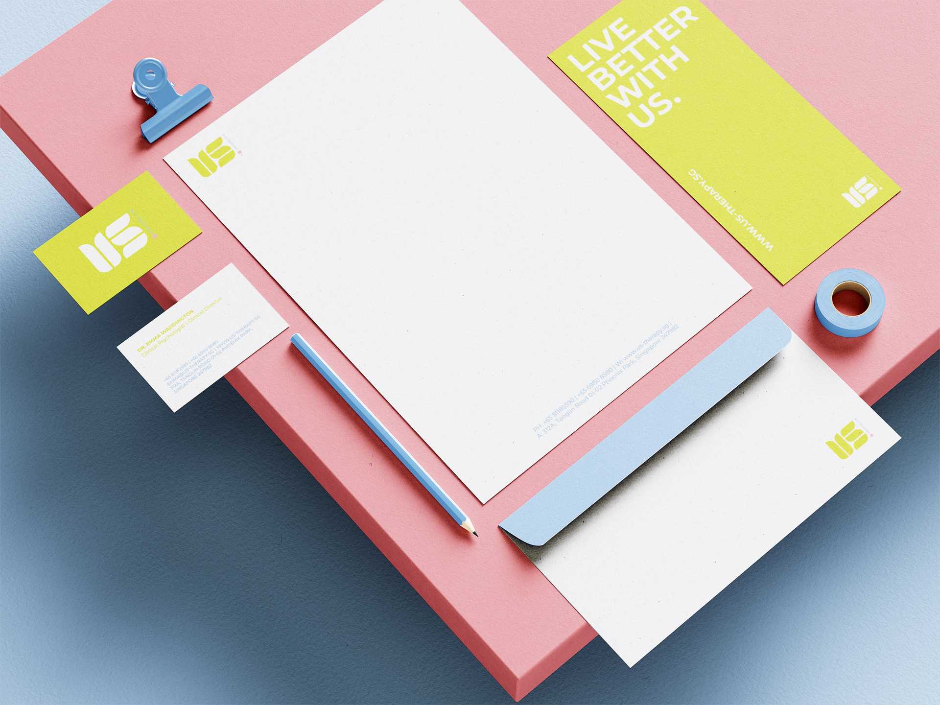
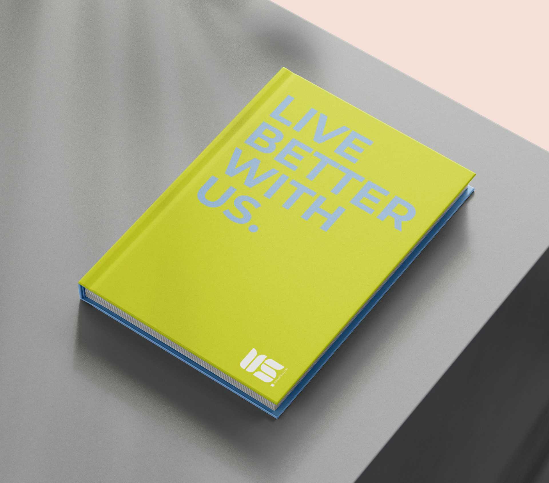
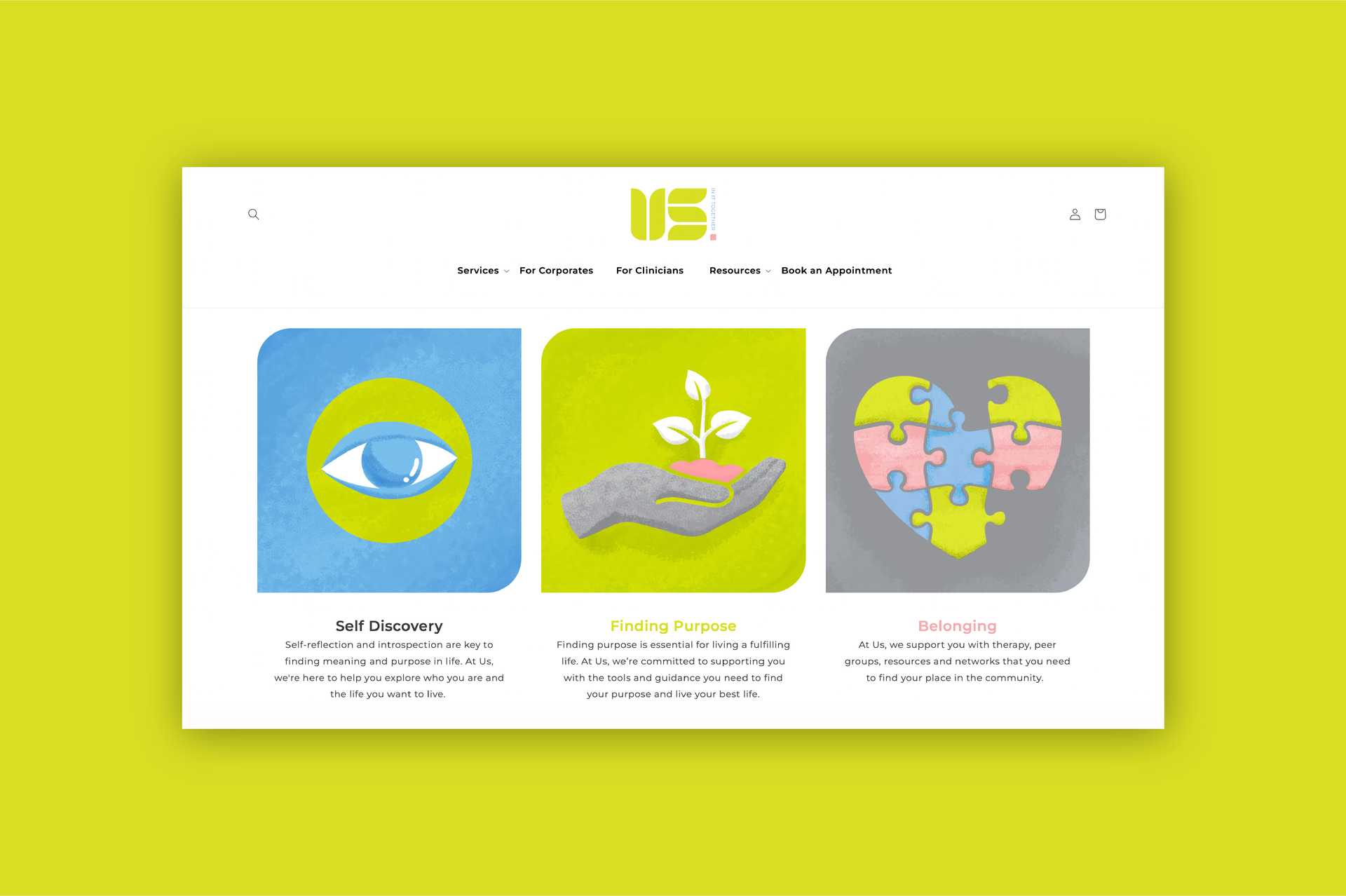
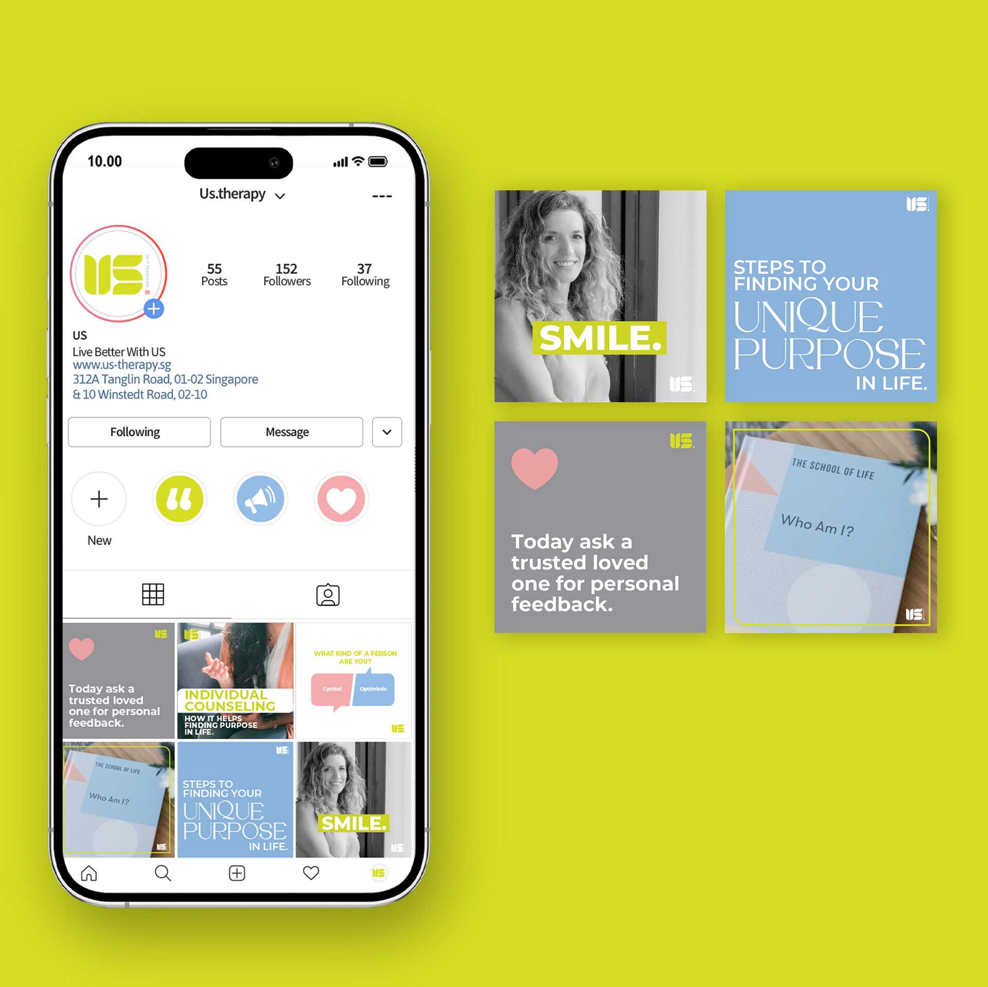
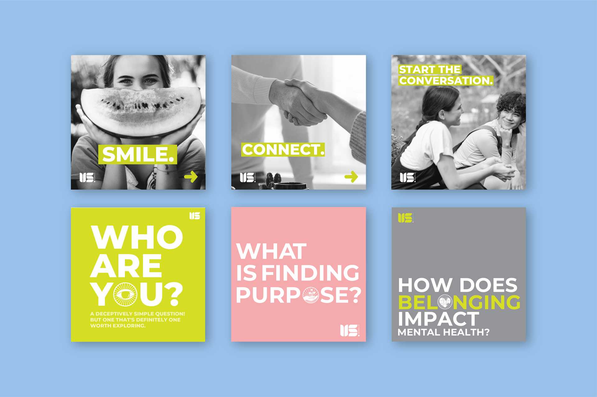
Print & Digital Media Design
We worked on the brand's social media creatives, web banners for the website, and spatial art. We focused on making the creatives easy and approachable to help people build trust easily with the brand. We used the positive colour palette from the Us brand palette combined with illustrations of characters who were meant to be part of the extended Us family.
